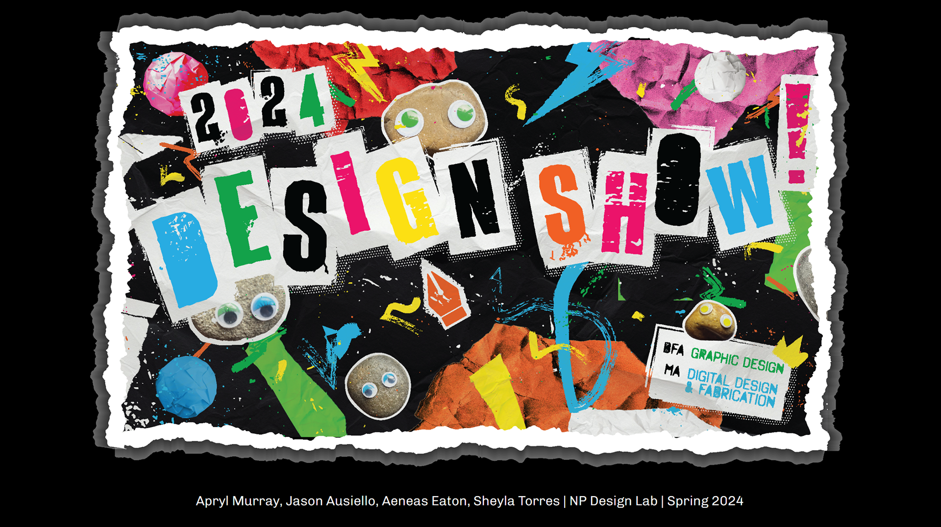
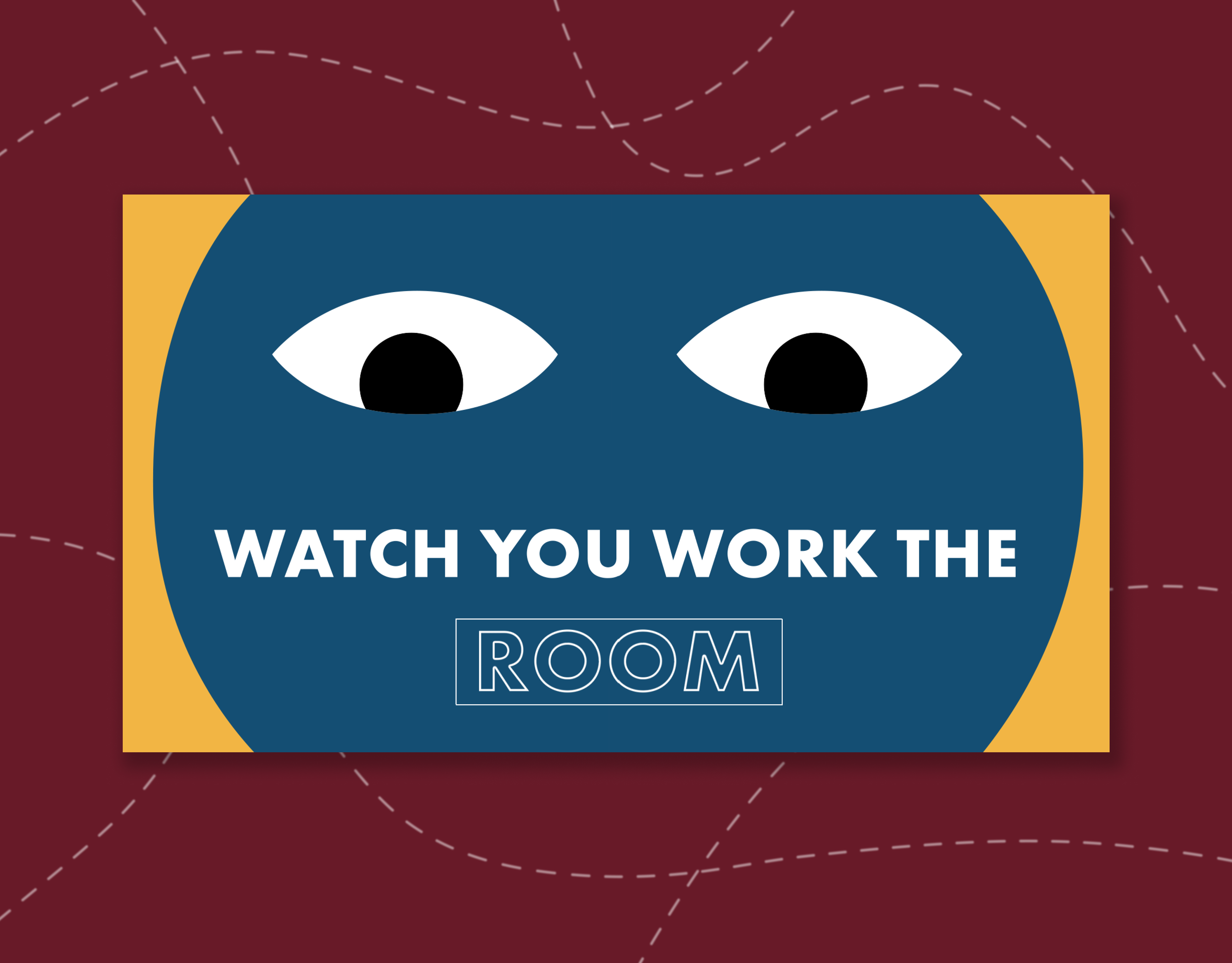
Animated promotional graphic.
Branding, Motion Design, Print
The Show
With the creation of the new Department of Design, the 2024 Design Show served as the capstone showcase for the graduating students within the department. I was part of the design team to create the overall branding for the show, which was used not only during the live show but also as promotion and will be use as inspiration for future displays, as the brand changes every year. Promotion included posters, social media posts, stickers, goodie bags, a trailer video, and a printed display. There is also a website and a
printed catalog.
printed catalog.
While all members on the team contributed to each element of the show in some way, my main contributions were in motion design/brand development.
Live Website - 2024show.newpaltz.design
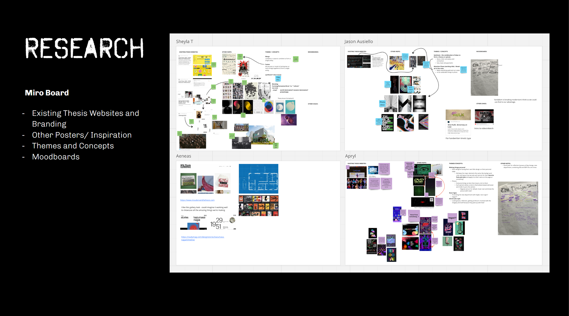
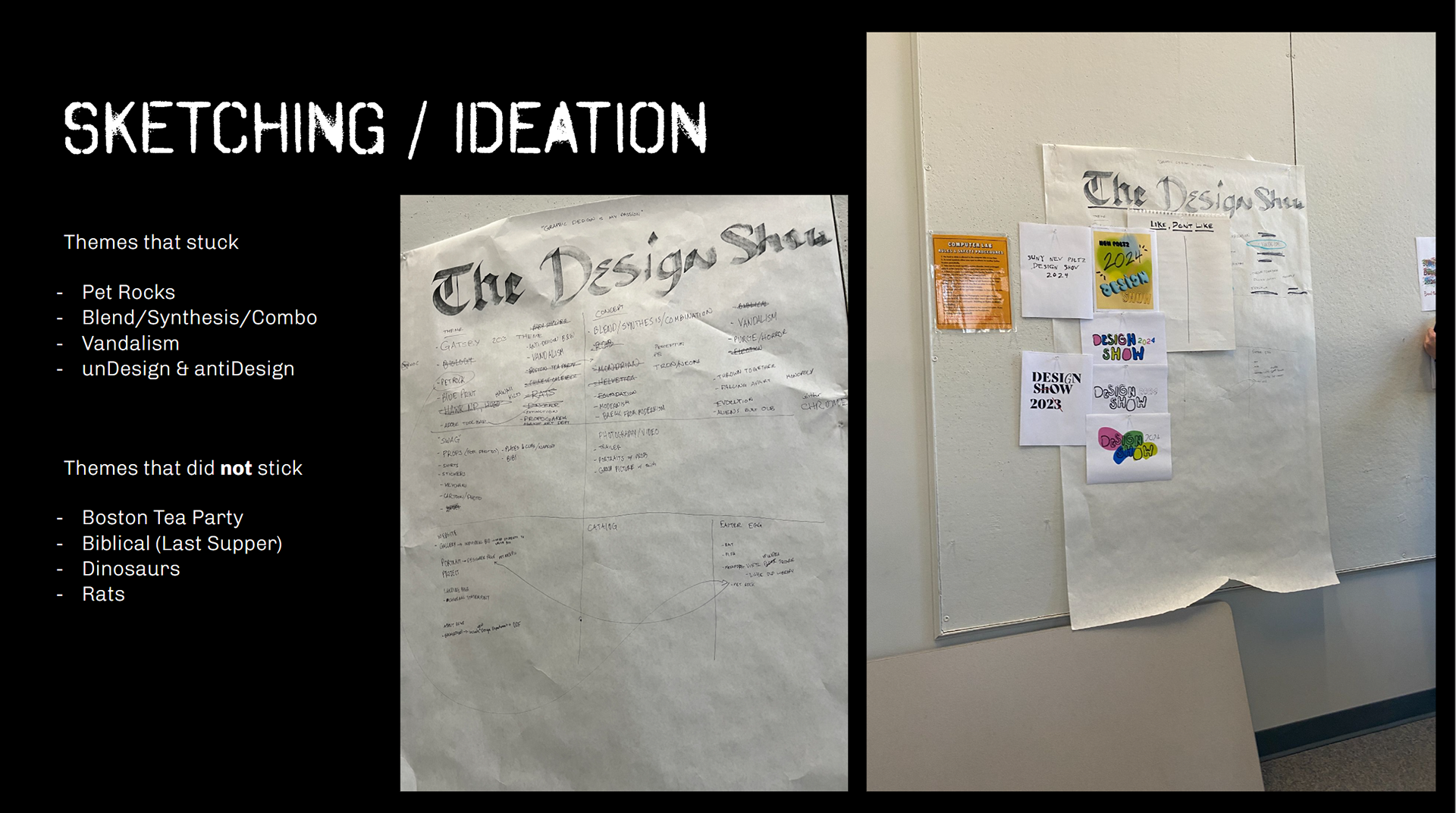
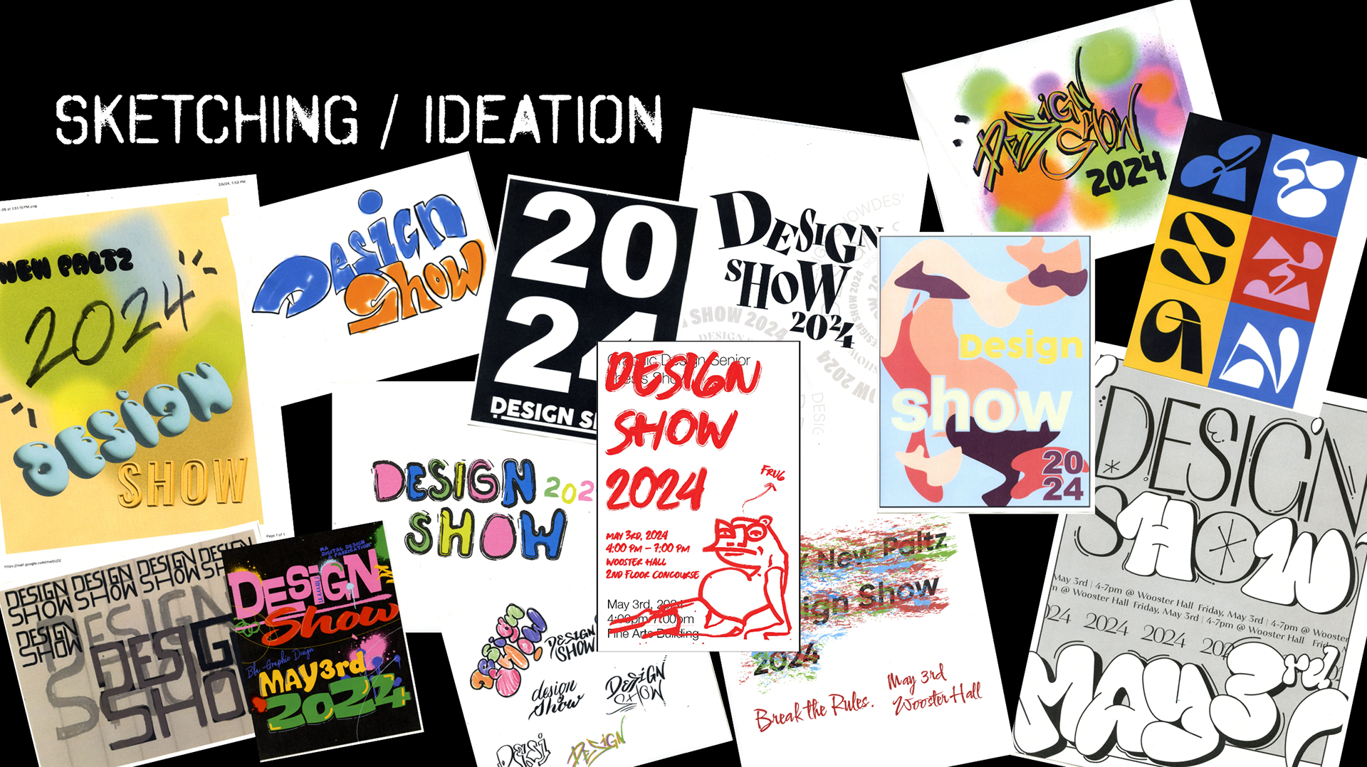
Process
Visual Identity - Design Rocks
The show's visual identity embraces "anti-design" and grunge aesthetics, incorporating collages, stencil-like elements, and grungy textures throughout. The team decided on this edgy approach to reflect the new Design Department's departure from traditional art conventions (and the school's Art Department). Through bold typography and colors, as well as a rule-breaking style, the show's brand solidifies the Design Department as a bold, boundary-pushing force in design thinking, seperating it from simply being "art".
The brand also allowed for a fun pun opportunity, "Design Rocks". The grunge/punk/rock feel alongside actual pet rocks, as you can see throughout the branding. Who doesn't love a good pun?
The brand also allowed for a fun pun opportunity, "Design Rocks". The grunge/punk/rock feel alongside actual pet rocks, as you can see throughout the branding. Who doesn't love a good pun?
Final Deliverables - Promotion
Social Media
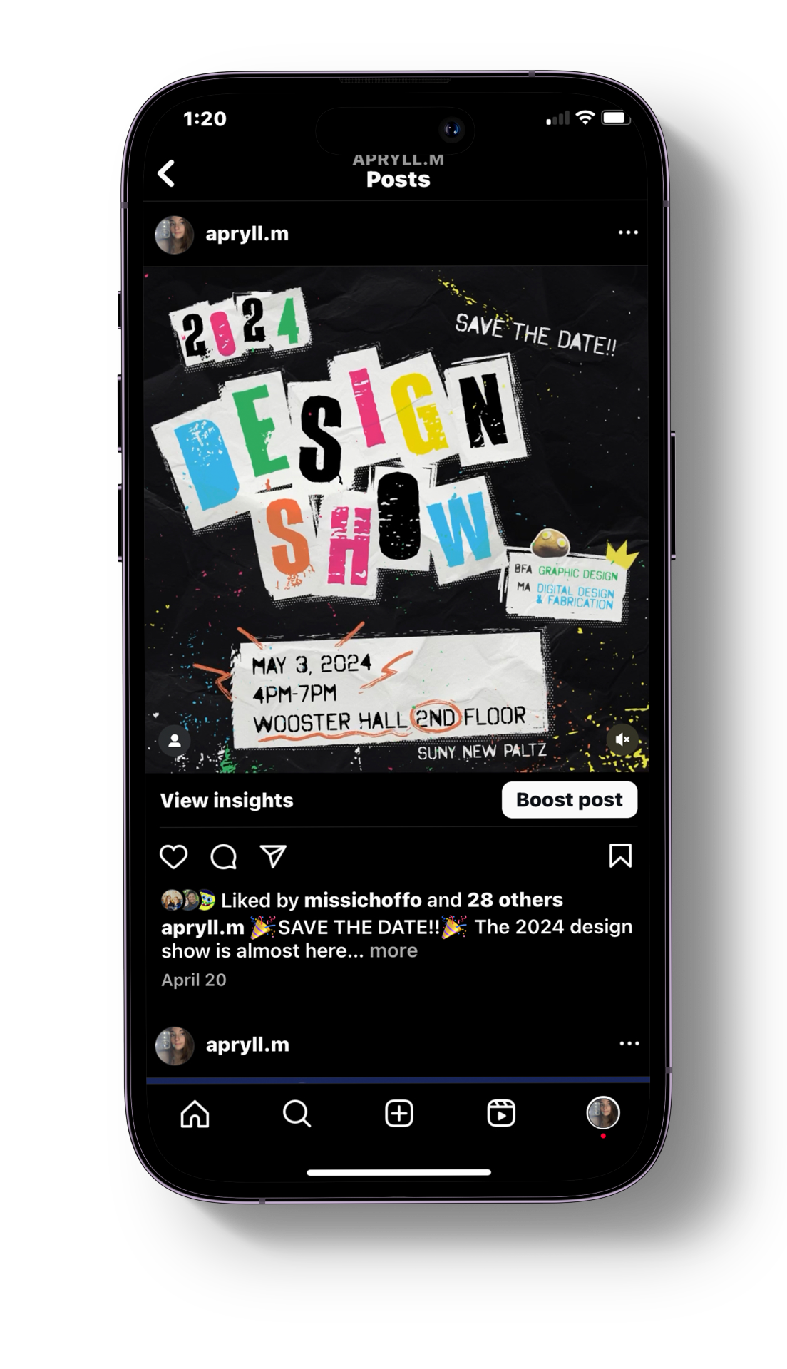
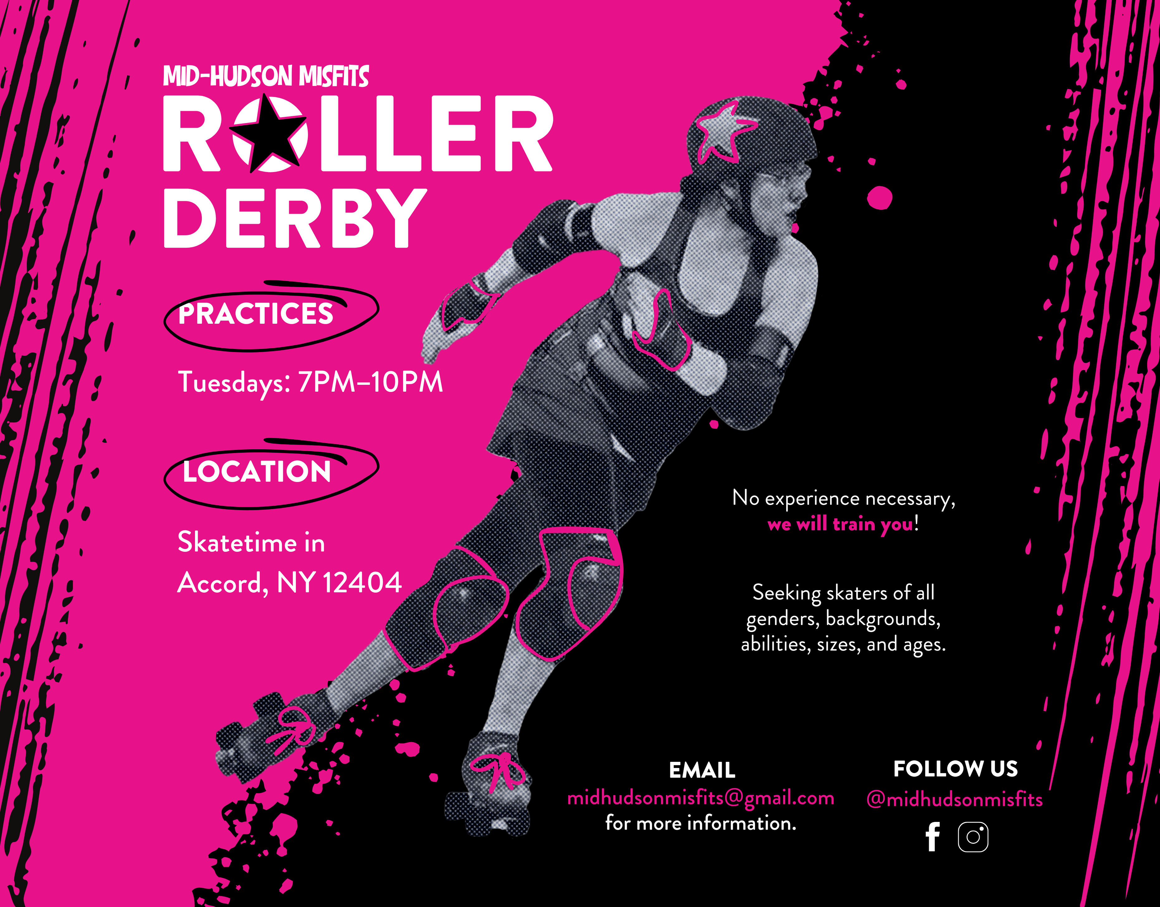
Social media version of poster. Posted on the department's official Instagram, as well as sent out to students part of the show to post on their own profiles.
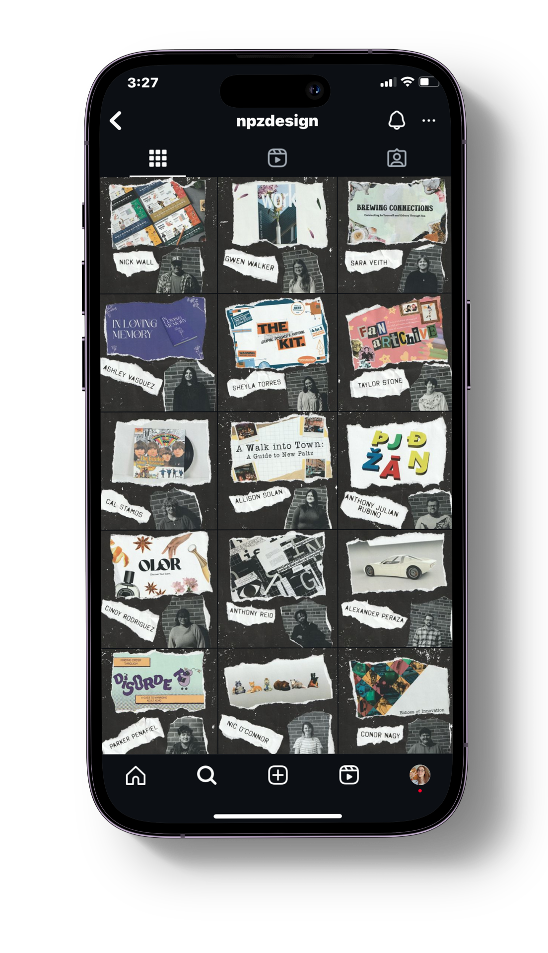
Individual student project Instagram posts.
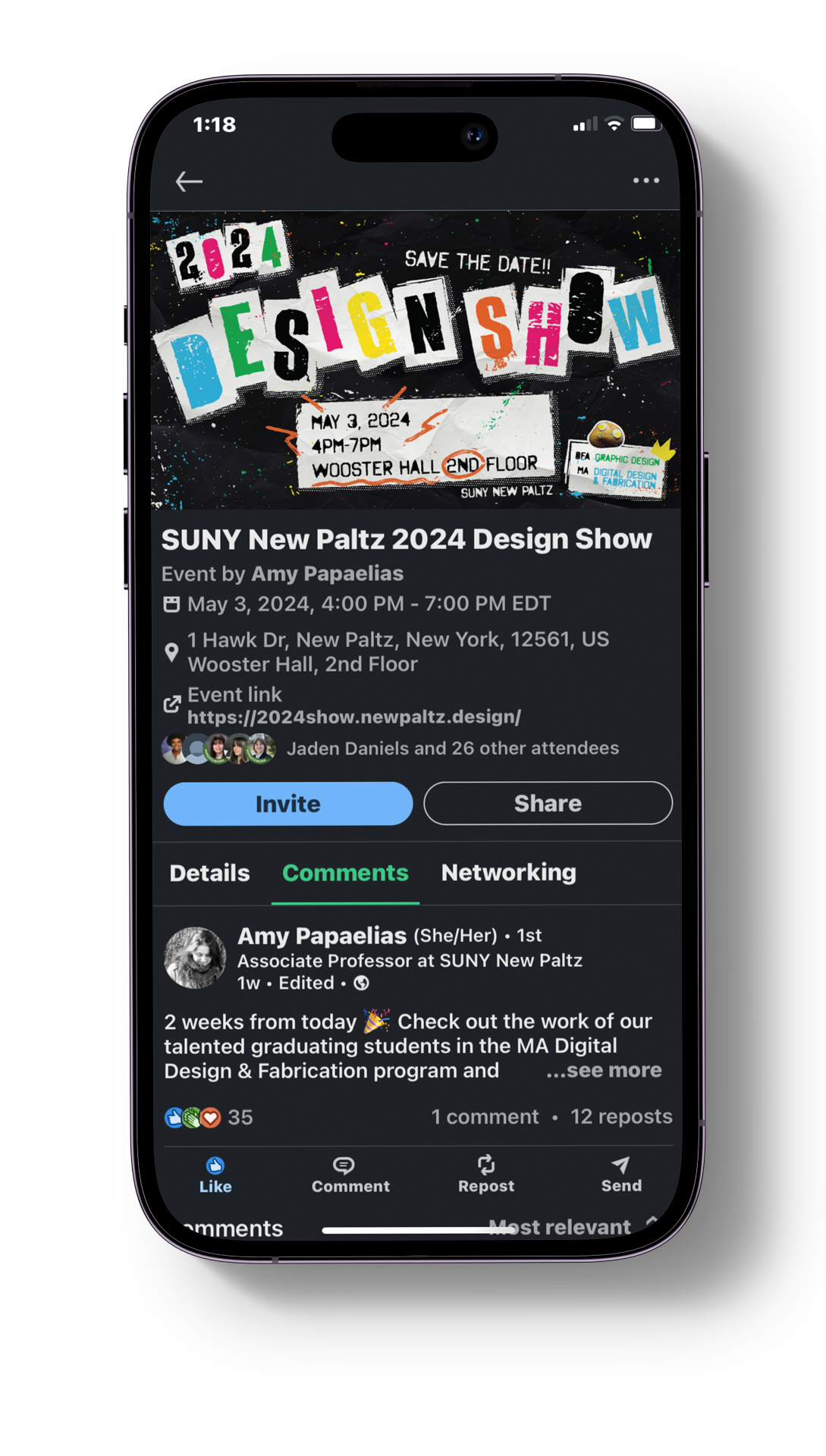
LinkedIn banner for event.
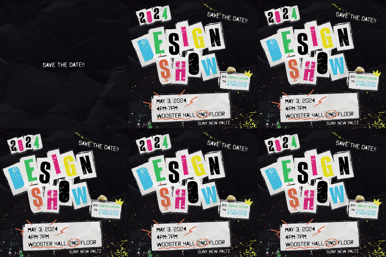
Social post animation.
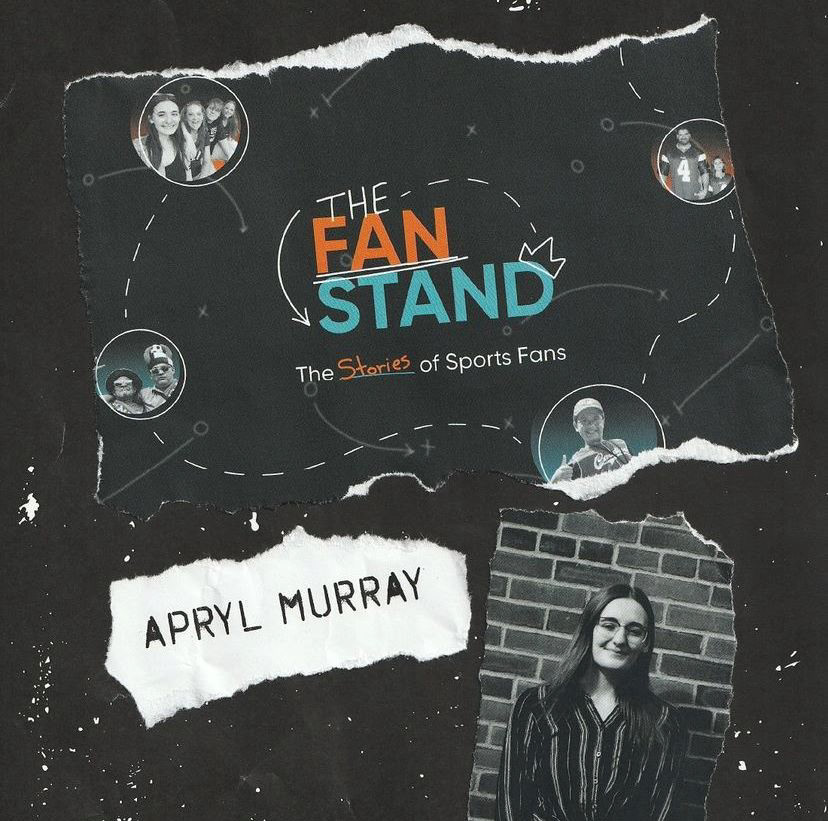
Individual student post (this one is mine!)
Promotional Trailer
Print
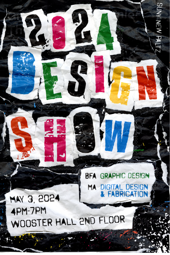
Printed, ripped, crumpled, glued back together, then rescanned to achieve authentic grunge effect.
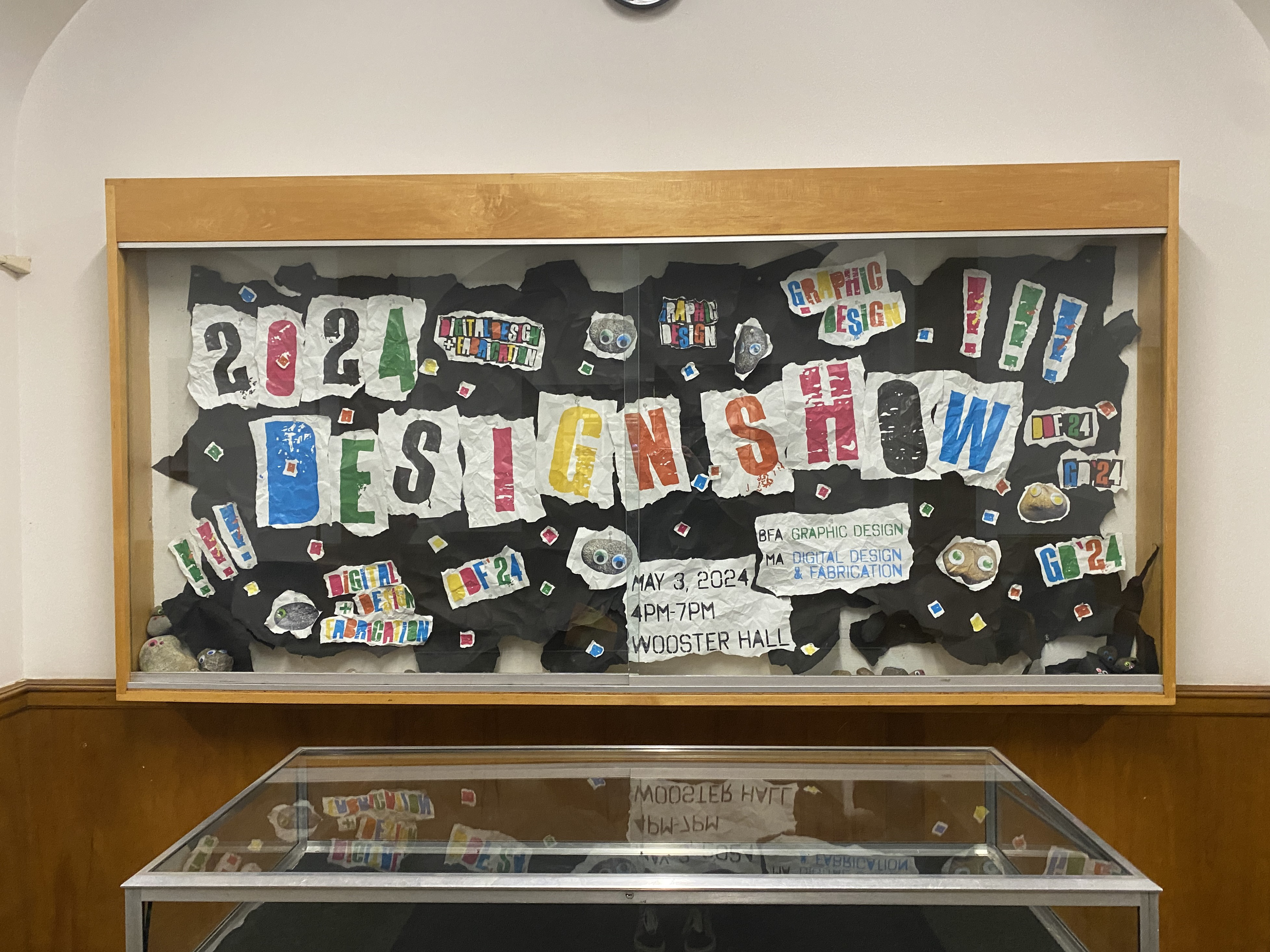
Large display poster in display case, was reused during day of show for a photo opportunity.
Final Deliverables - Show Day
Printed Catalog
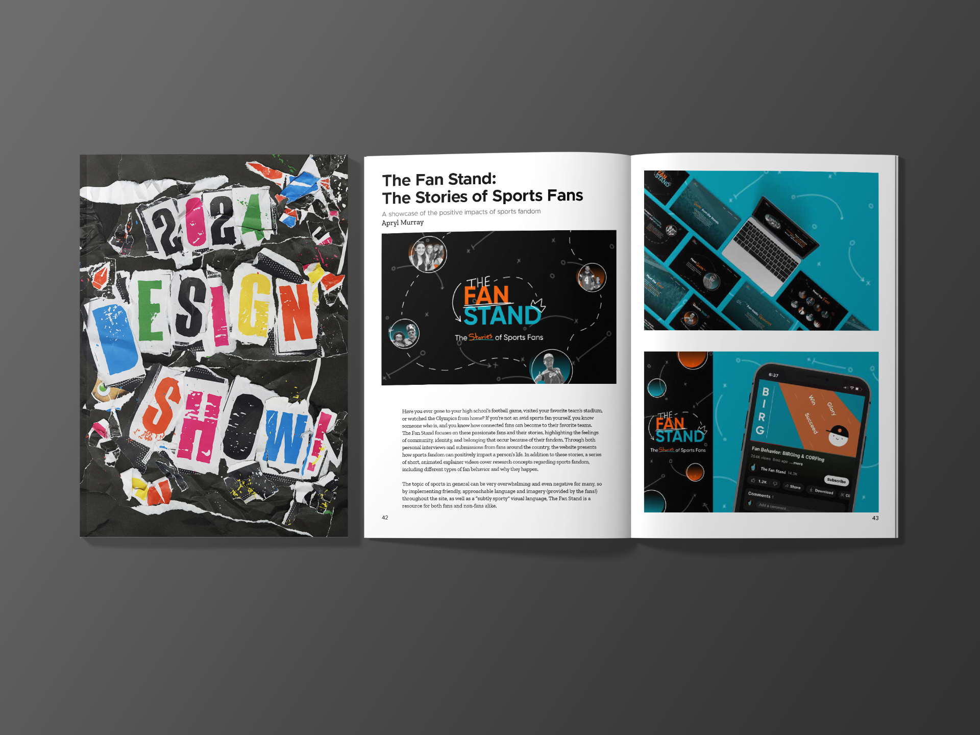
Image by yeven_popov on Freepik
Examples of catalog pages.
Directional signage
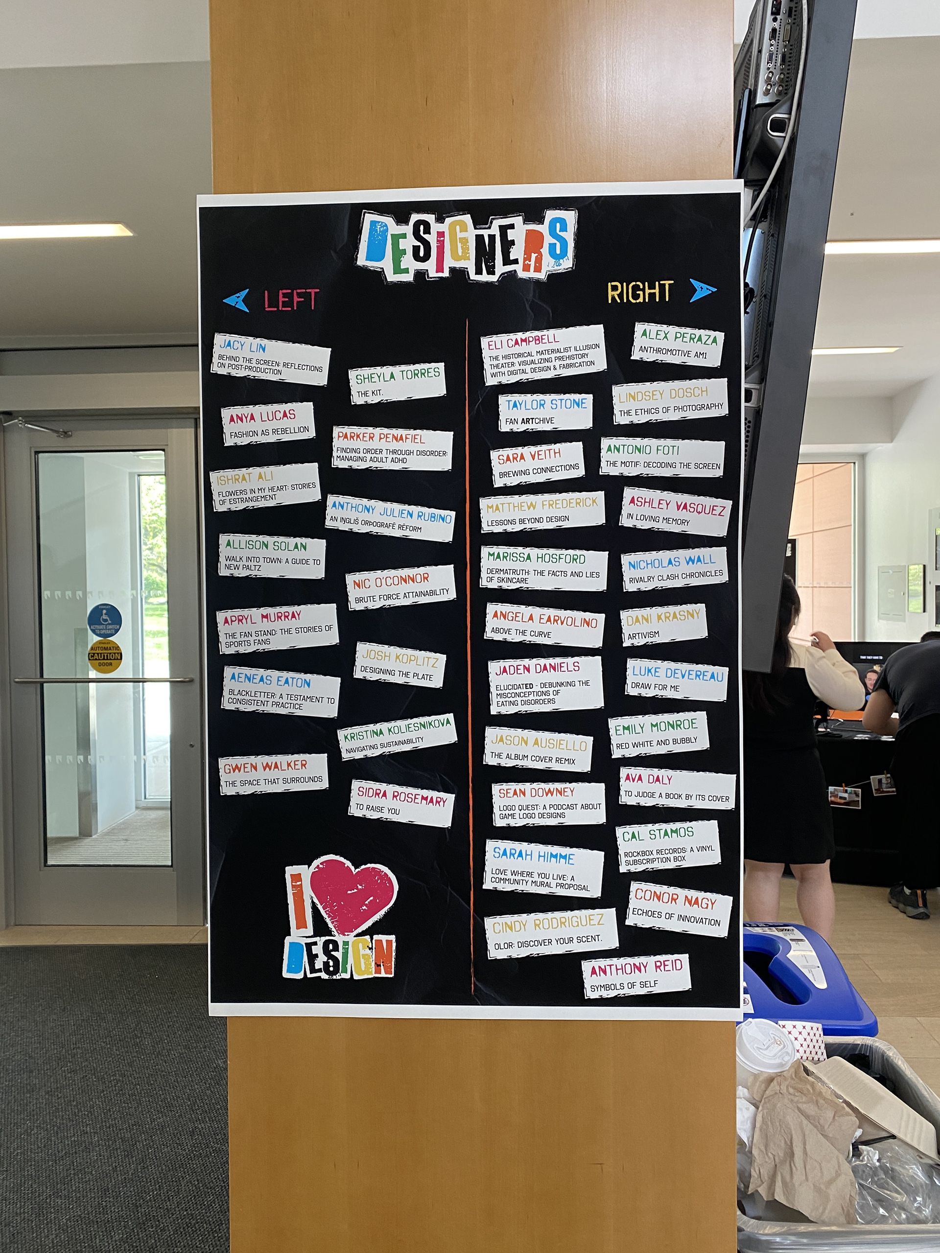
Directional poster to show where students are. Two were printed for facing either direction in the venue.
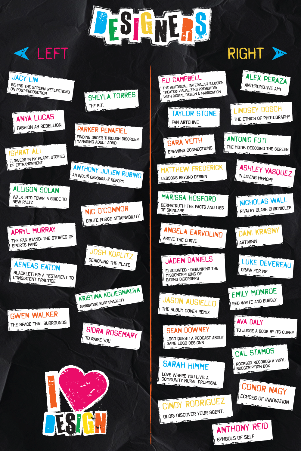
"Swag Table"
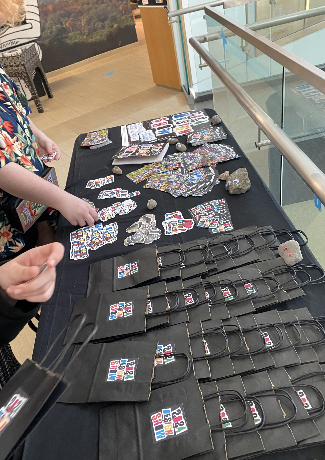
Goodie bags, a lot of stickers, 2 post card designs, pet rocks, catalogs, and the poster.
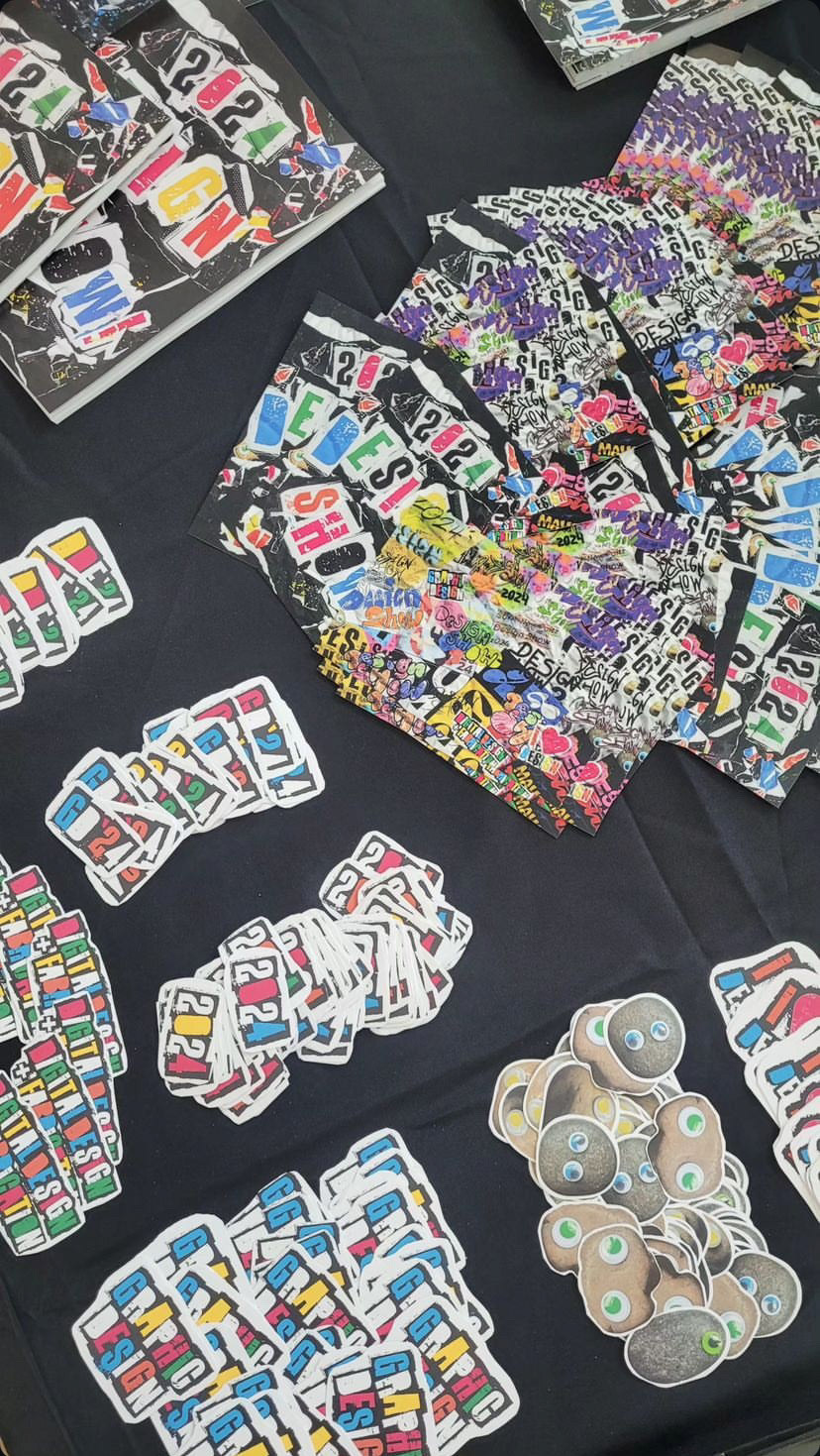
A lot of stickers, 2 post card designs, catalogs.
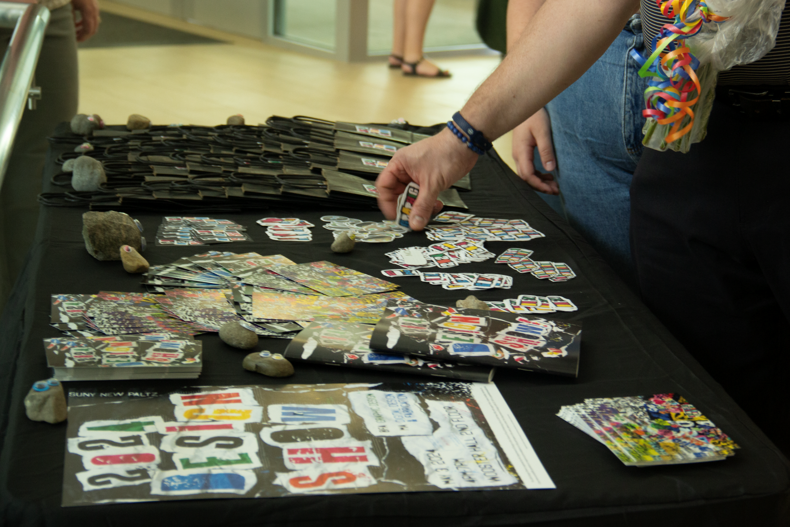
Goodie bags, a lot of stickers, 2 post card designs, pet rocks, catalogs, and the poster.
Environmental Design
Fun with Vinyl
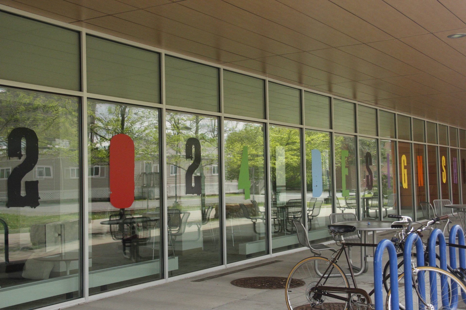
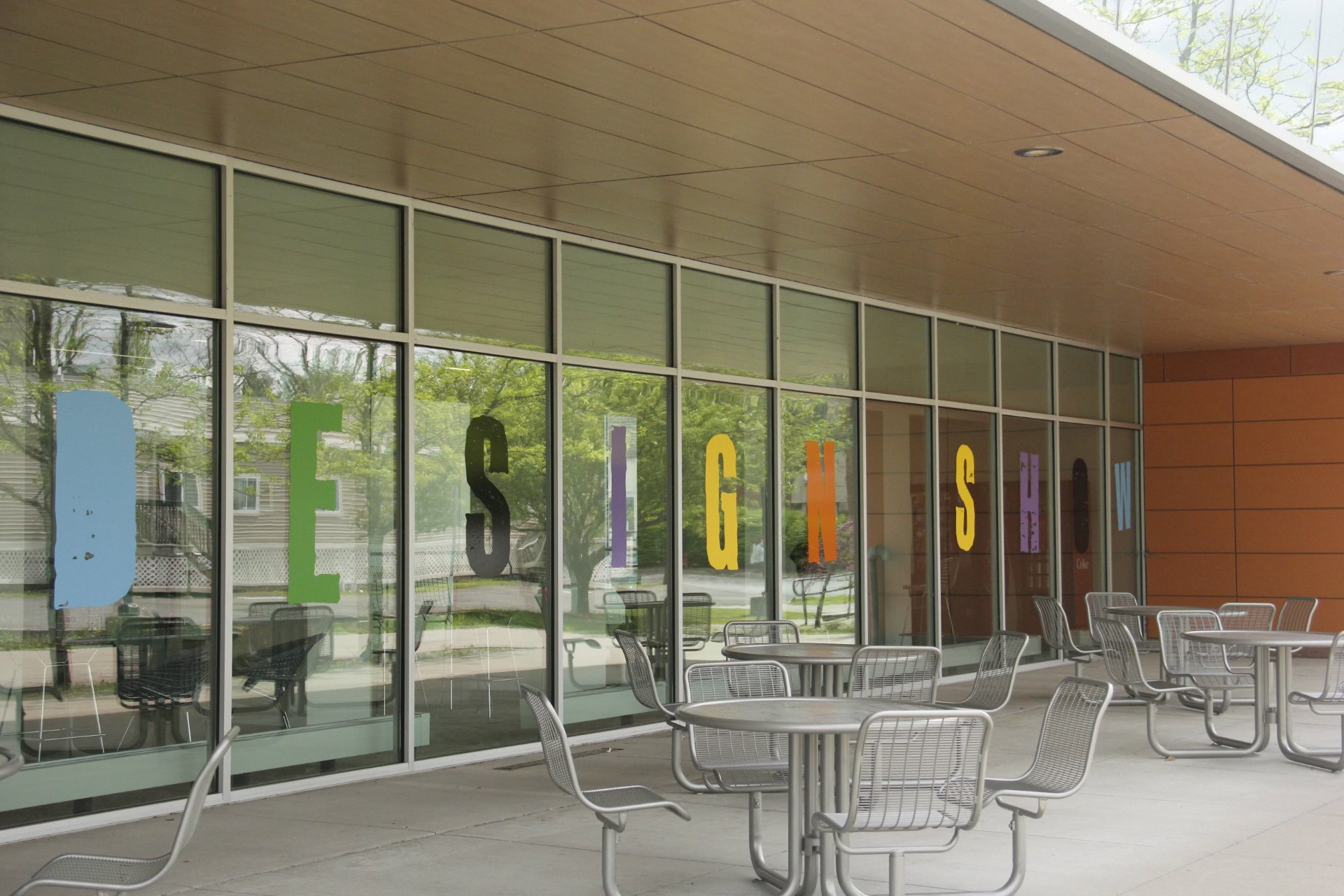
On top of creating motion graphics for the brand, I was also responsible for the vinyl elements that were put up throughout the venue. The main "attraction" (I guess?) was the large type we printed and put up near the second floor entrance that spells out "2024 DESIGN SHOW" in different colors to match our branding. The random, unaligned placement was also on purpose I promise! We also had exactly the amount of window space to fit each letter on their own pane with spaces between the words...talk about meant to be!
The colors are not an exact match due to limited materials the school had, but it still worked out wonderfully and we had so much fun putting them up the night before. Not as fun taking them down after the show, but still a great experience. We were able to get lots of help from our peers who were part of the show but not the design team, so that was nice of them.
The colors are not an exact match due to limited materials the school had, but it still worked out wonderfully and we had so much fun putting them up the night before. Not as fun taking them down after the show, but still a great experience. We were able to get lots of help from our peers who were part of the show but not the design team, so that was nice of them.
The Main Attraction (kind of, not really)
The Process
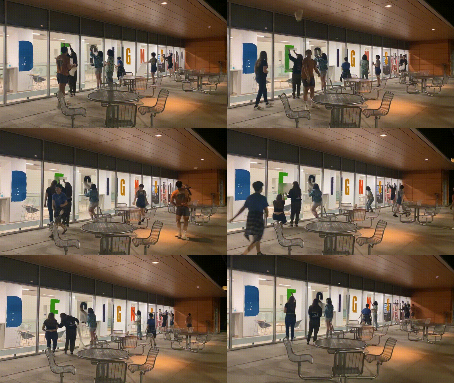
Quick time lapse of everyone putting up the big vinyl type.
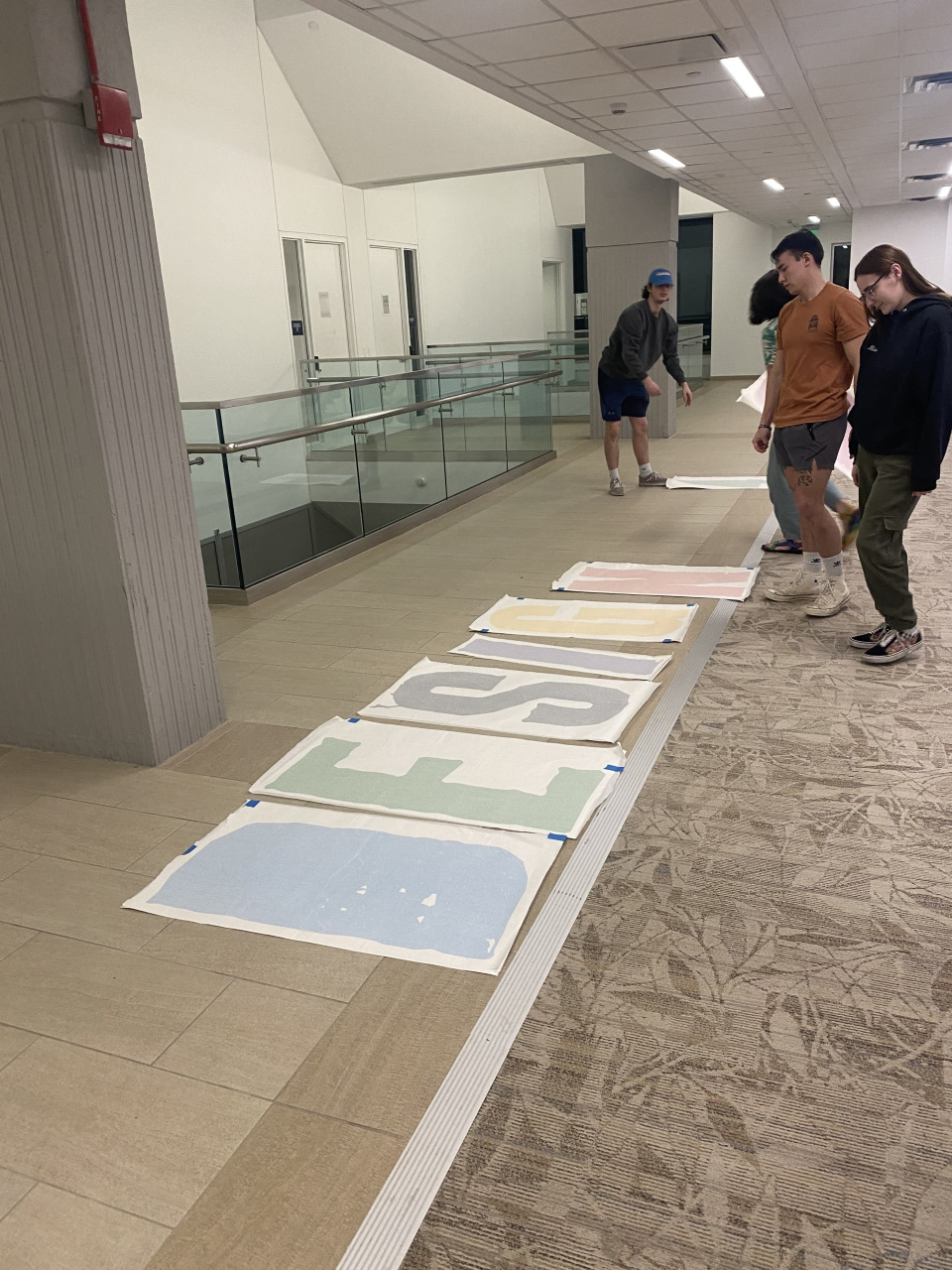
Jason, Aeneas, our professor Kristoff, and I preparing to put up the letters.
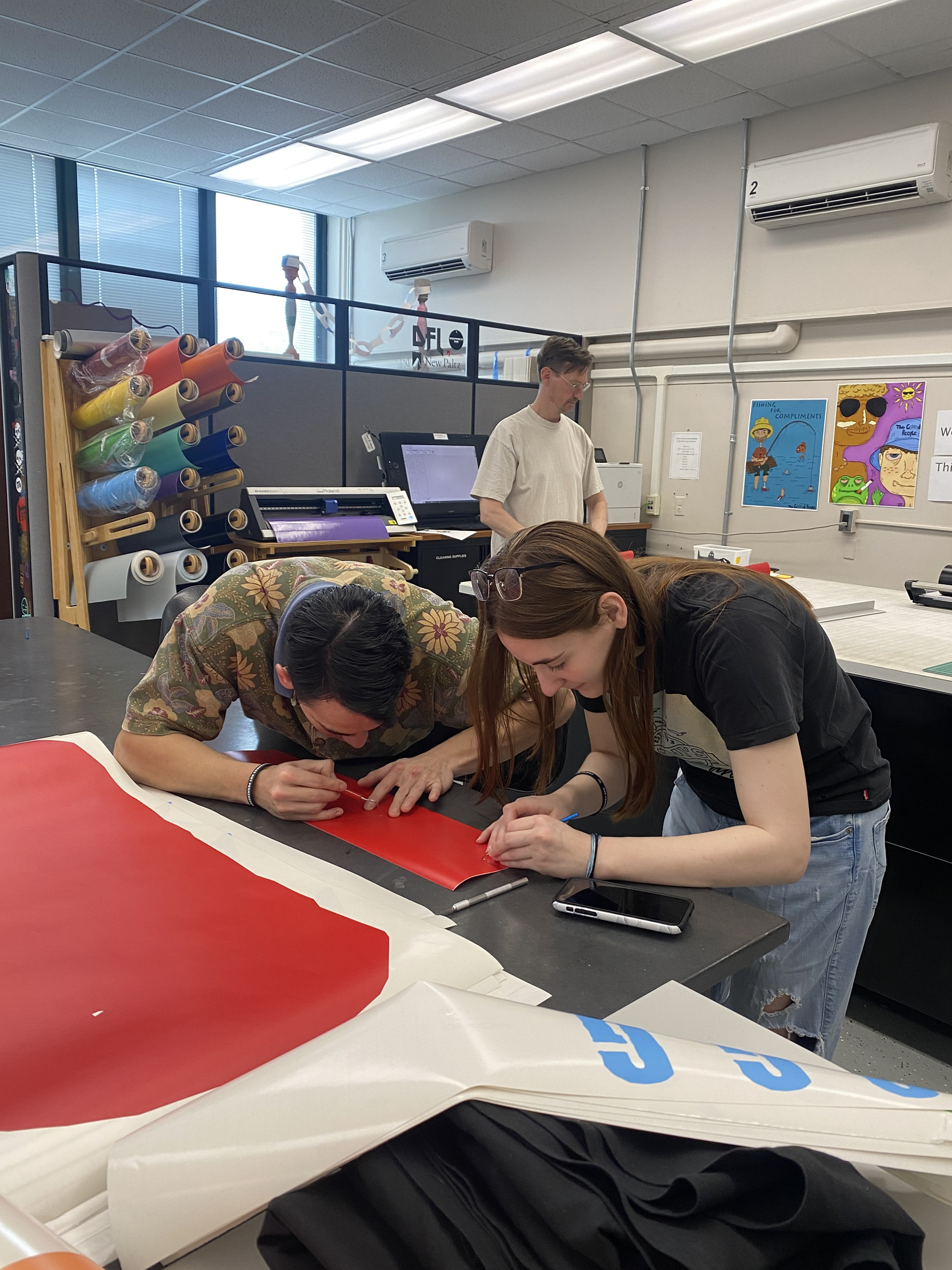
Aeneas and I peeling the smaller vinyl letters.
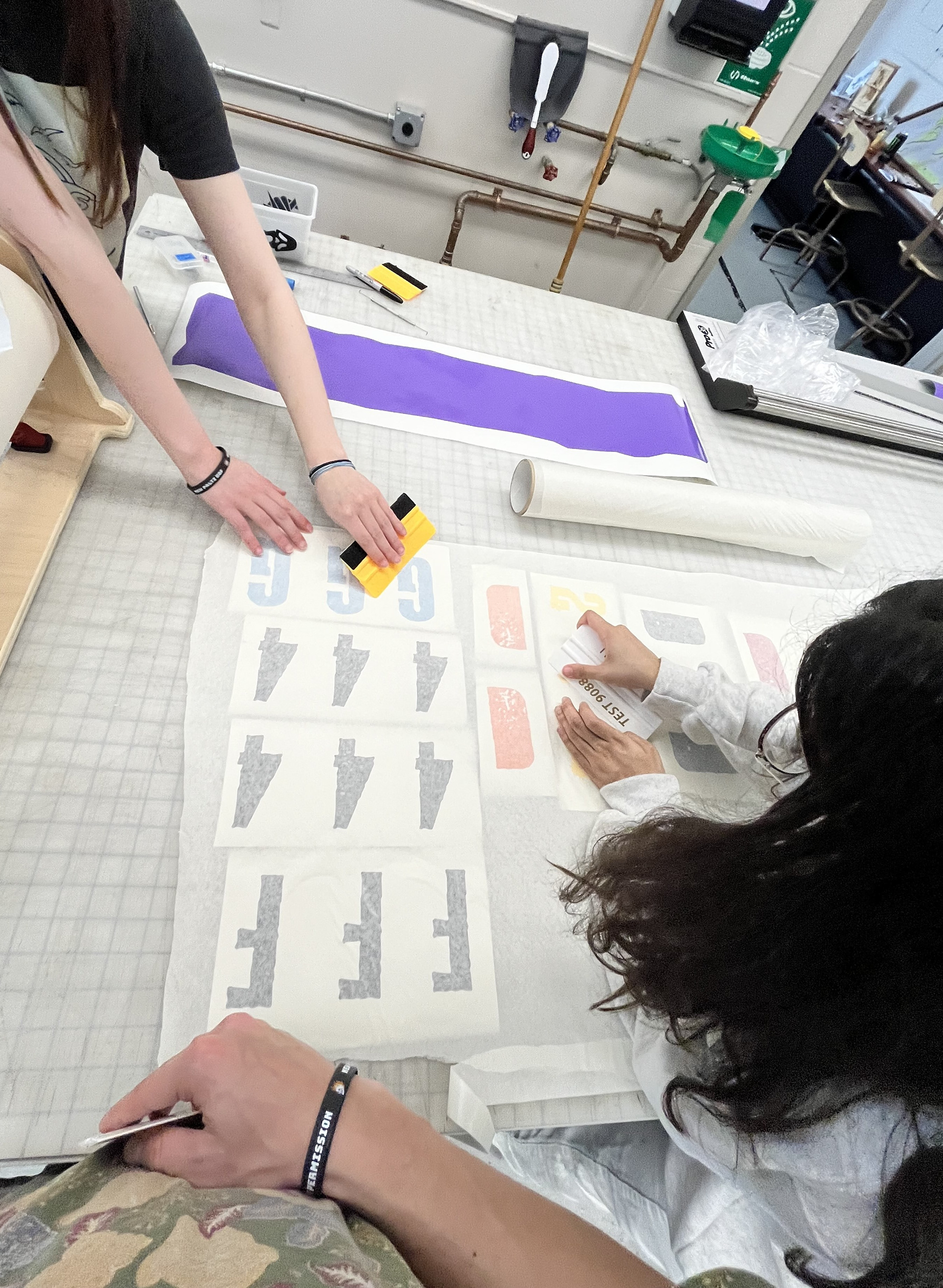
Aeneas, Sheyla, and I preparing the smaller vinyl lettering in the printing lab.
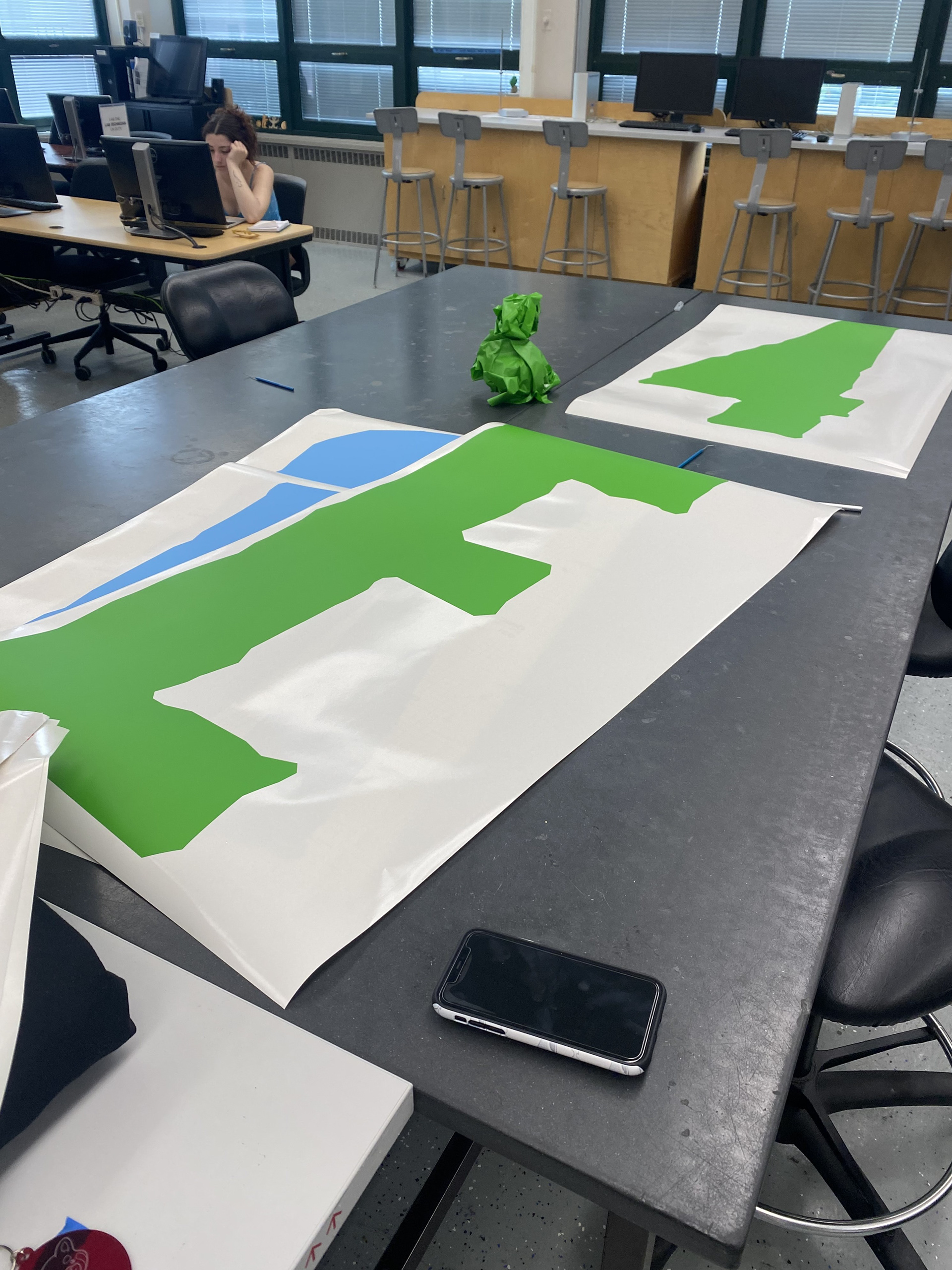
Some of the big vinyl type, with my iPhone 11 for scale.
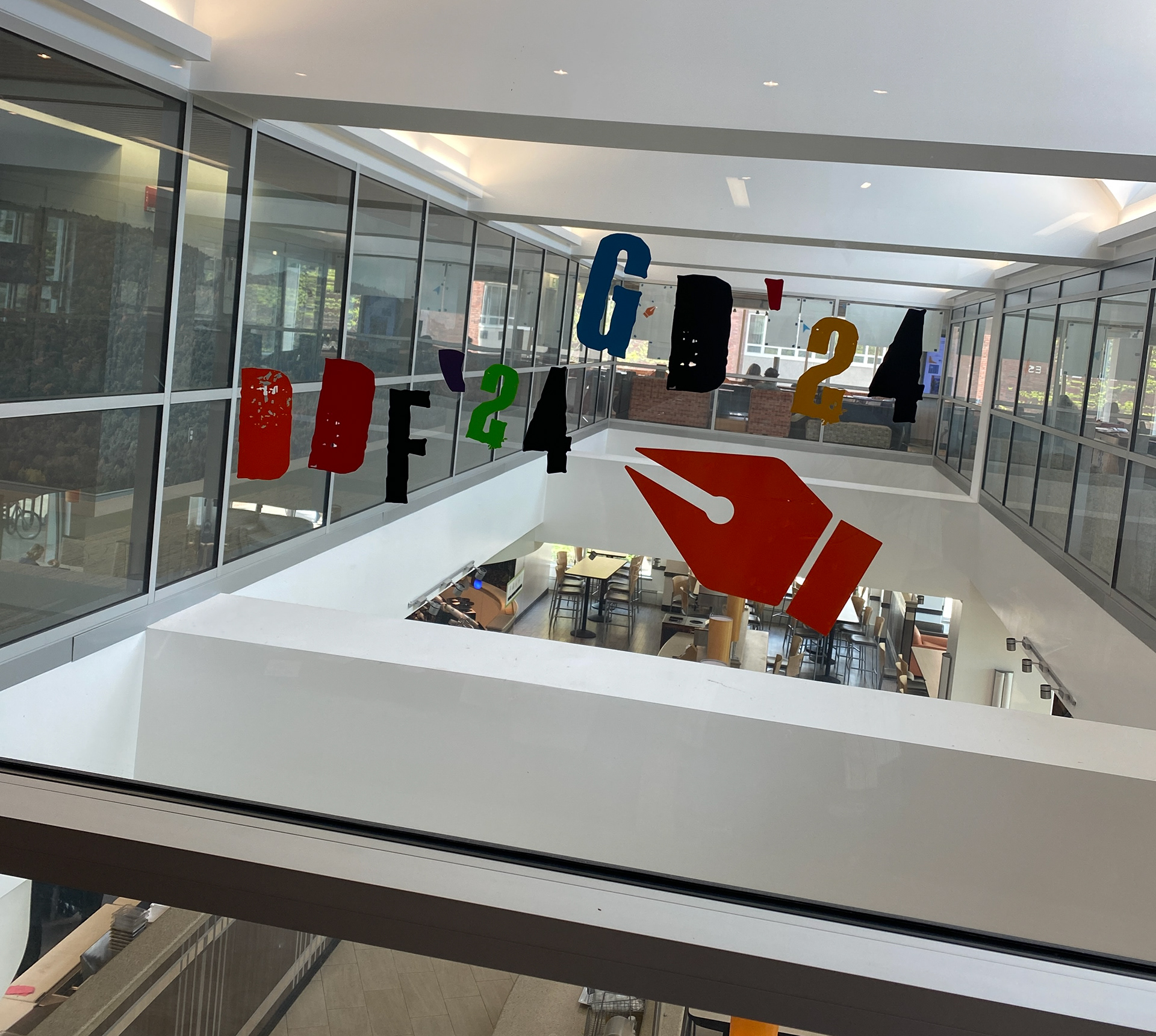
Example of smaller vinyl type and elements (a pen tool icon).
Reflection
All of the students part of the show! I wish I had a better quality photo but this was the only one that was taken...
Collaboration
Working As A Team
This was my first experience working with a design team on something that would be seen by the public (as in not for a school project) and it was such a wonderful experience! The four of us worked so well together despite our very busy schedules, utilizing collaboration tools like Miro, Google Drive, and Adobe Cloud to keep the workflow going remotely. While all of us helped one another on every aspect of the show, we each were able to showcase our specialties and create something we are all proud of.
Behind The Scenes - Project Scope
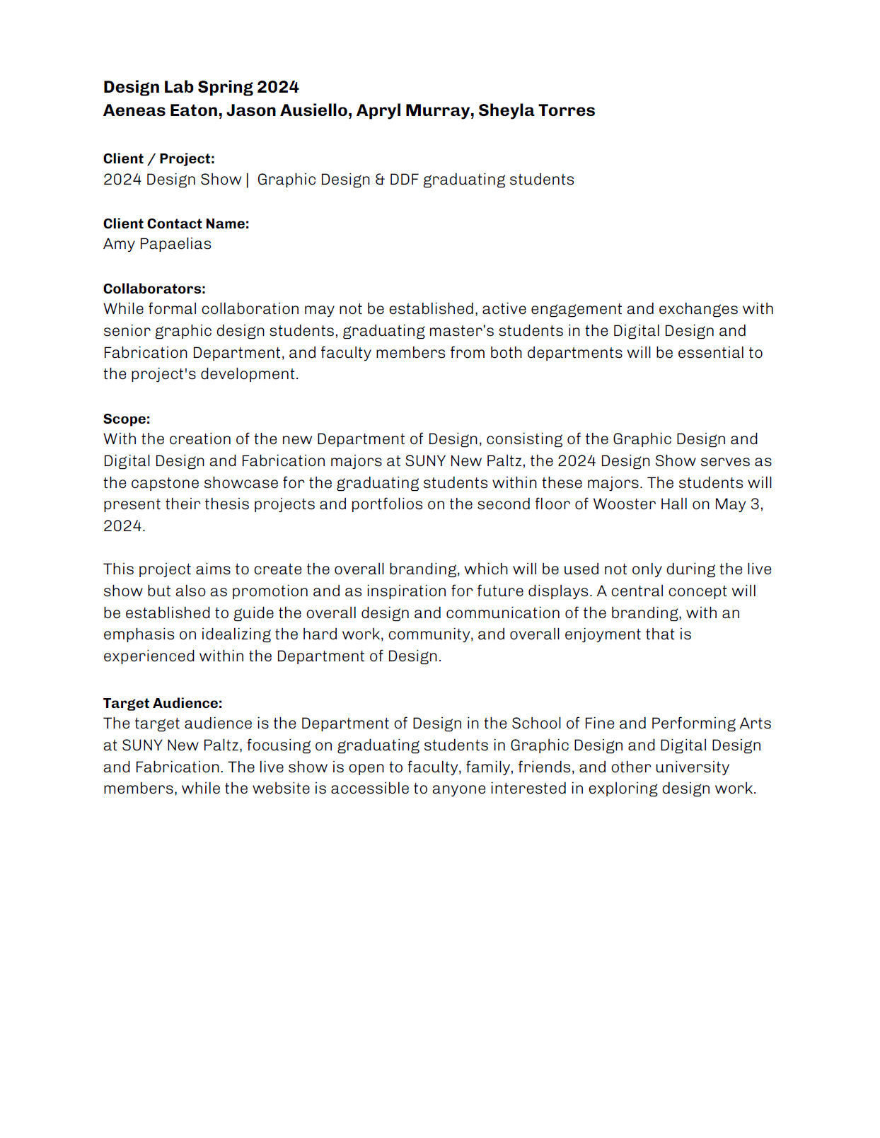
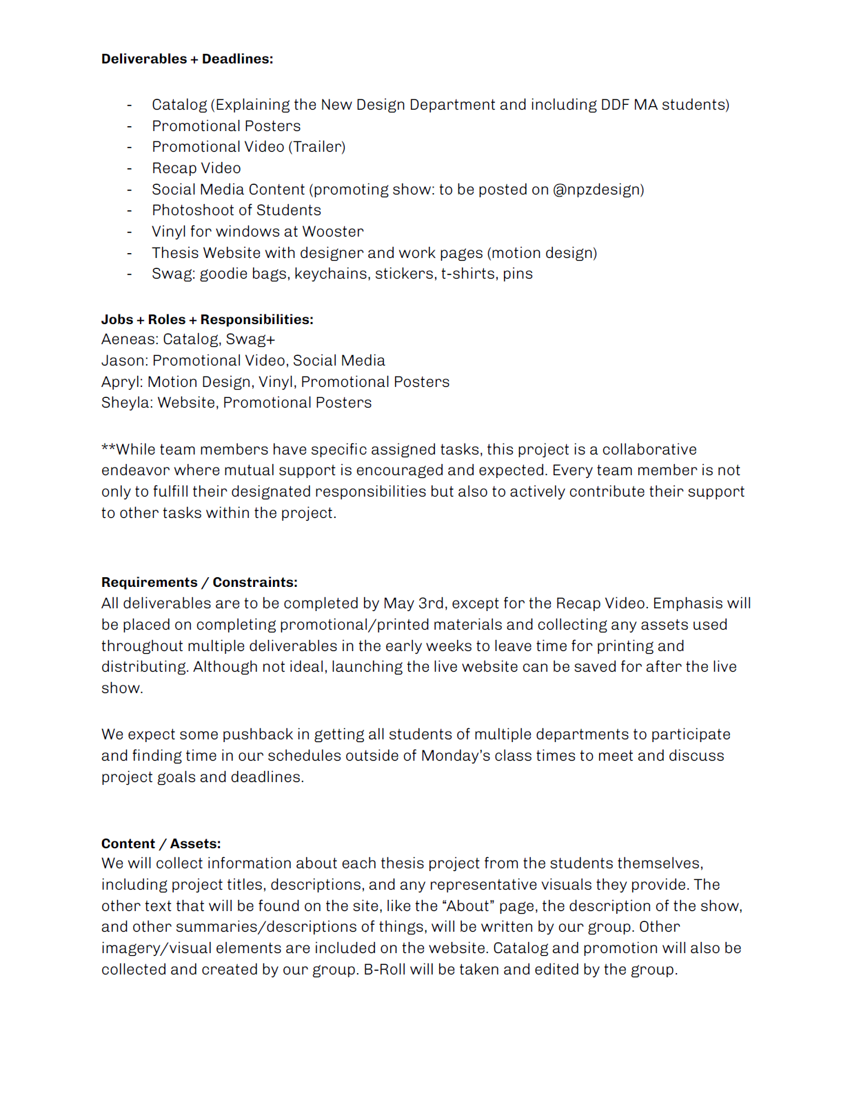
Behind The Scenes - Case Study
