Process
The problem
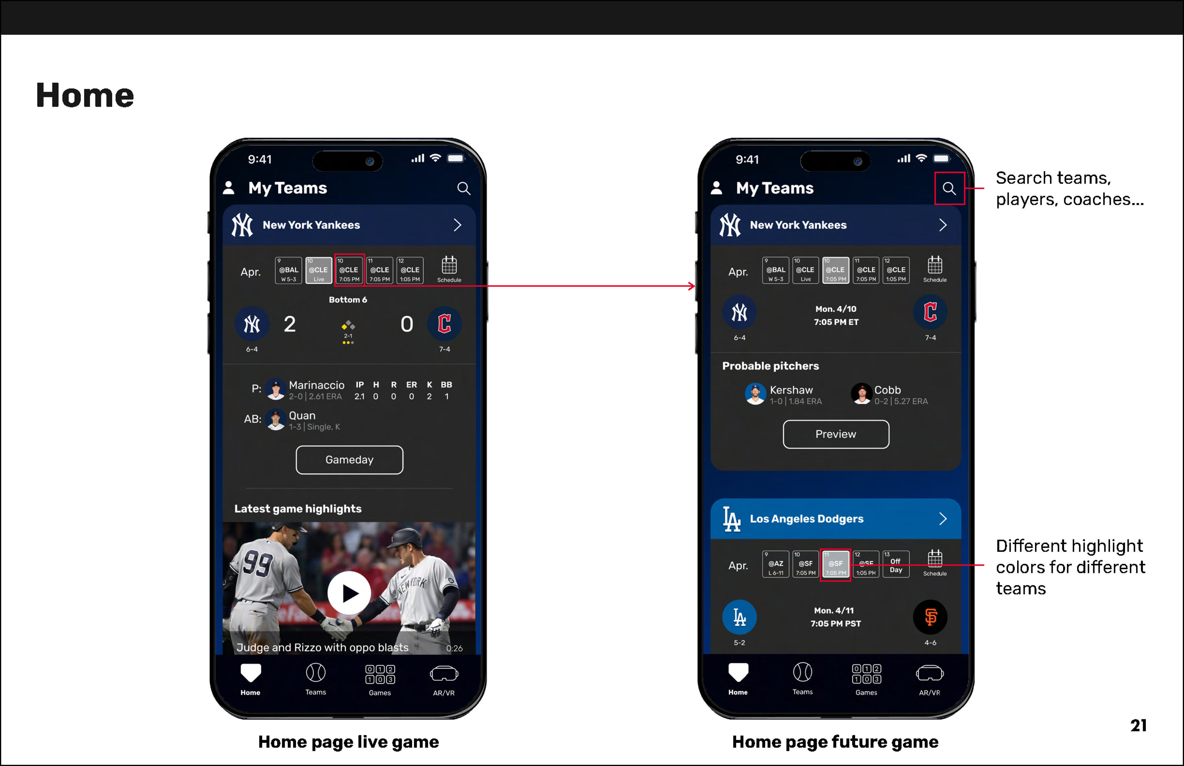
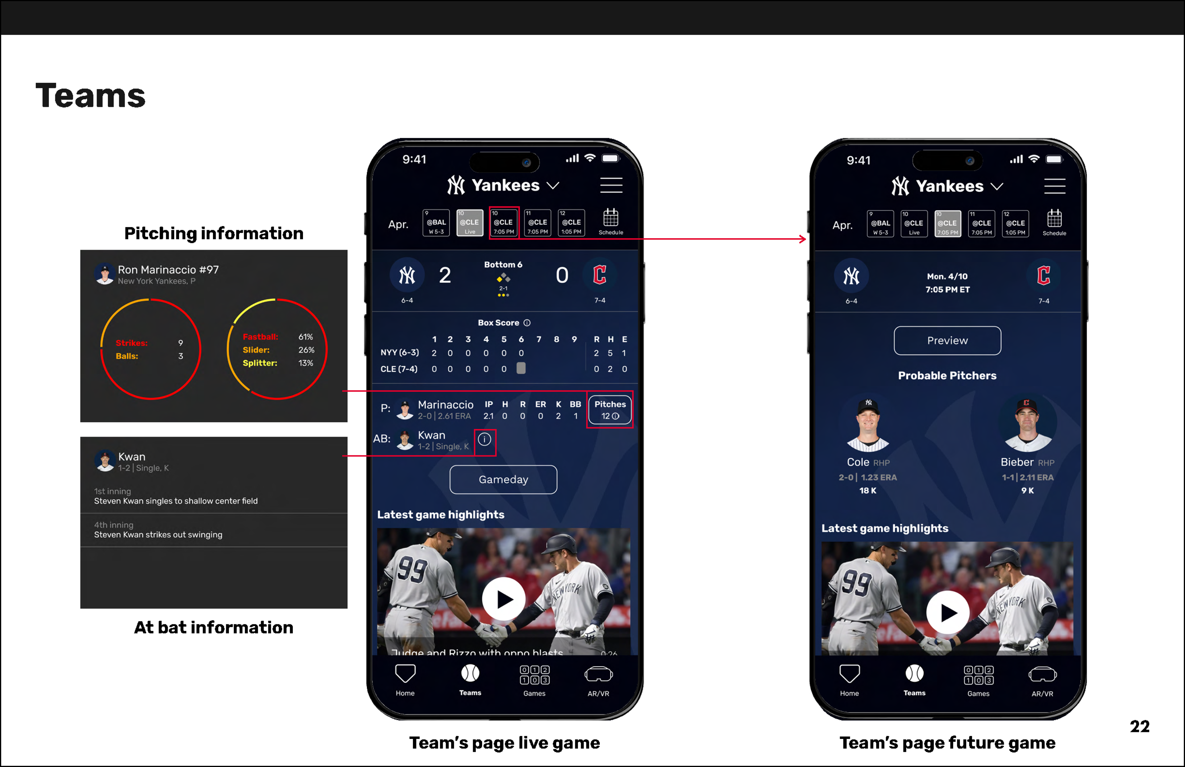
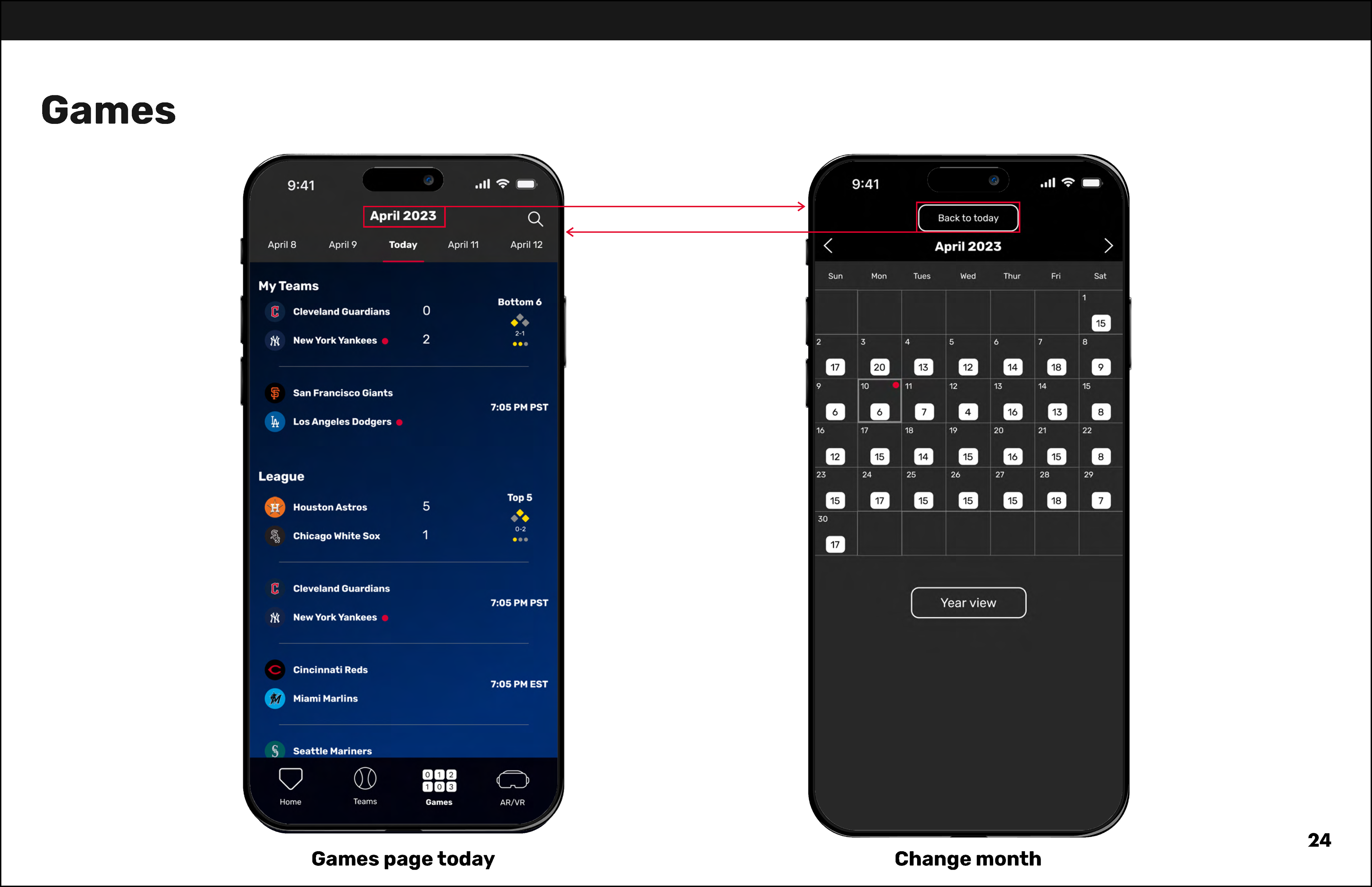
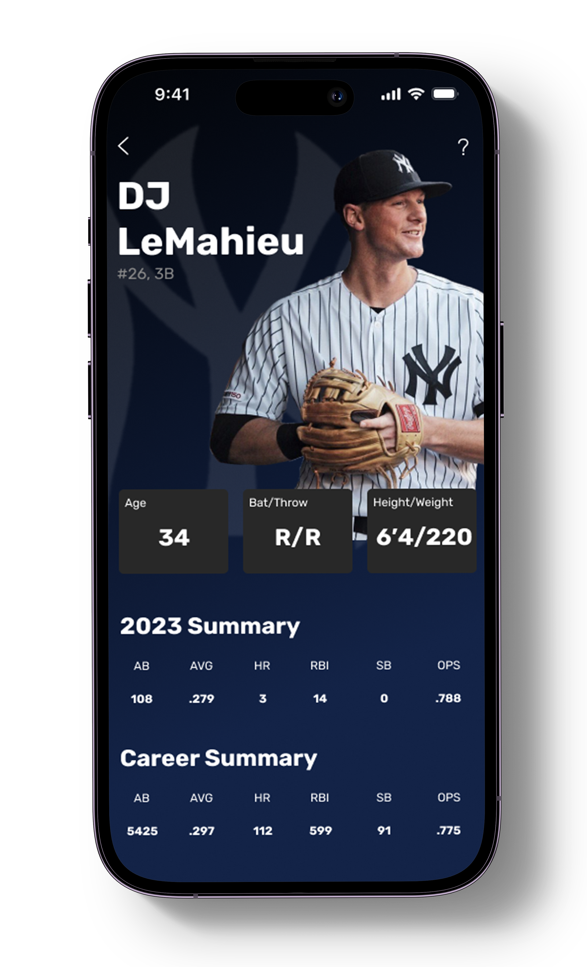
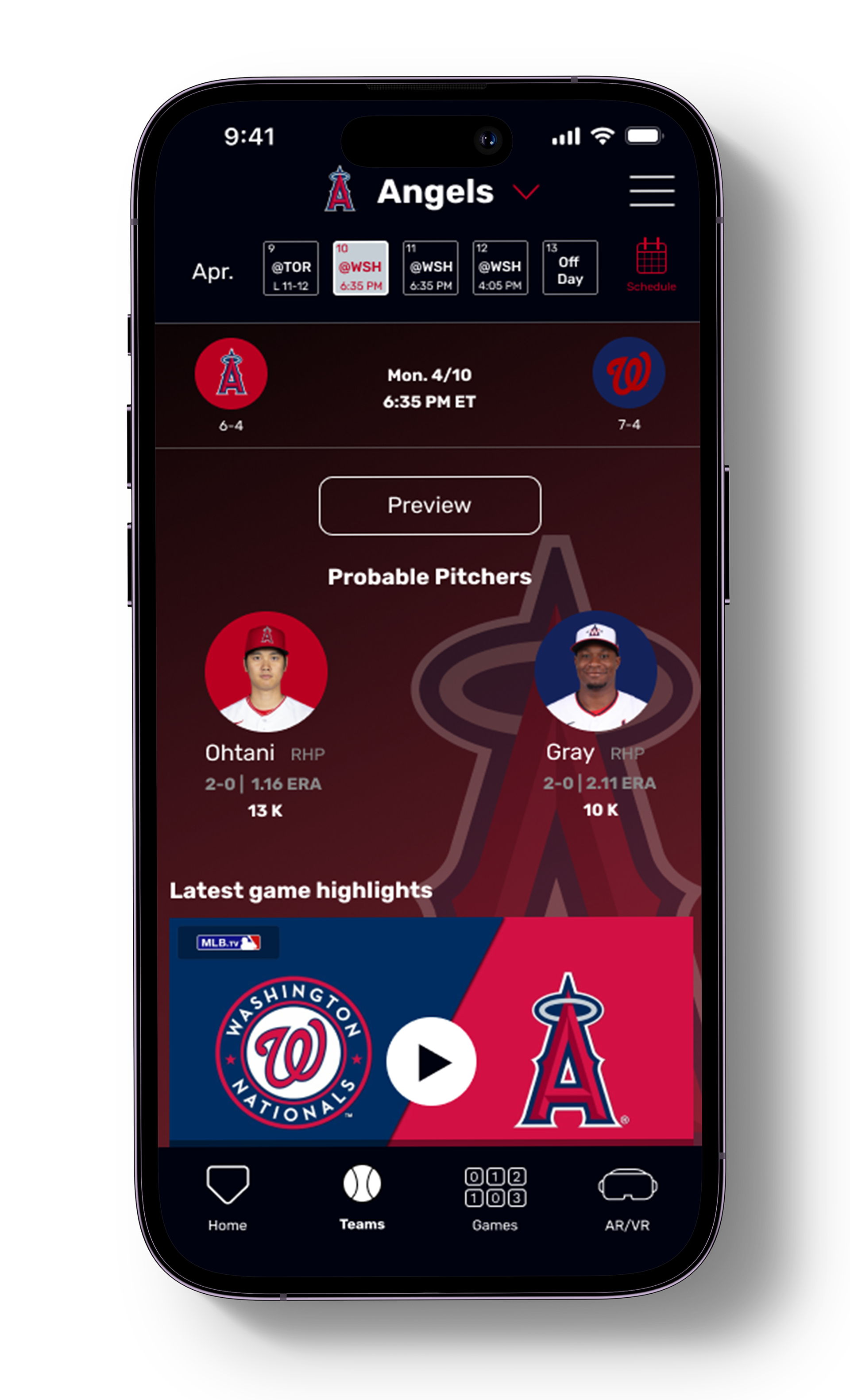
Baseball itself is a sport that, by nature, deals with a lot of information. The current MLB (Major League Baseball) app is the place to go to get all of that information, but as it has been updated and more has been added, it has gotten overwhelming and even unorganized in some places. My goal with this redesign was to create a more specified purpose for the app rather than the place to gather every piece of information possible with more intuitive organization and user experience. Instead of a "watching/tracking games and news" app, this redesign is an app used to track and learn about baseball statistics and the game itself.
Research
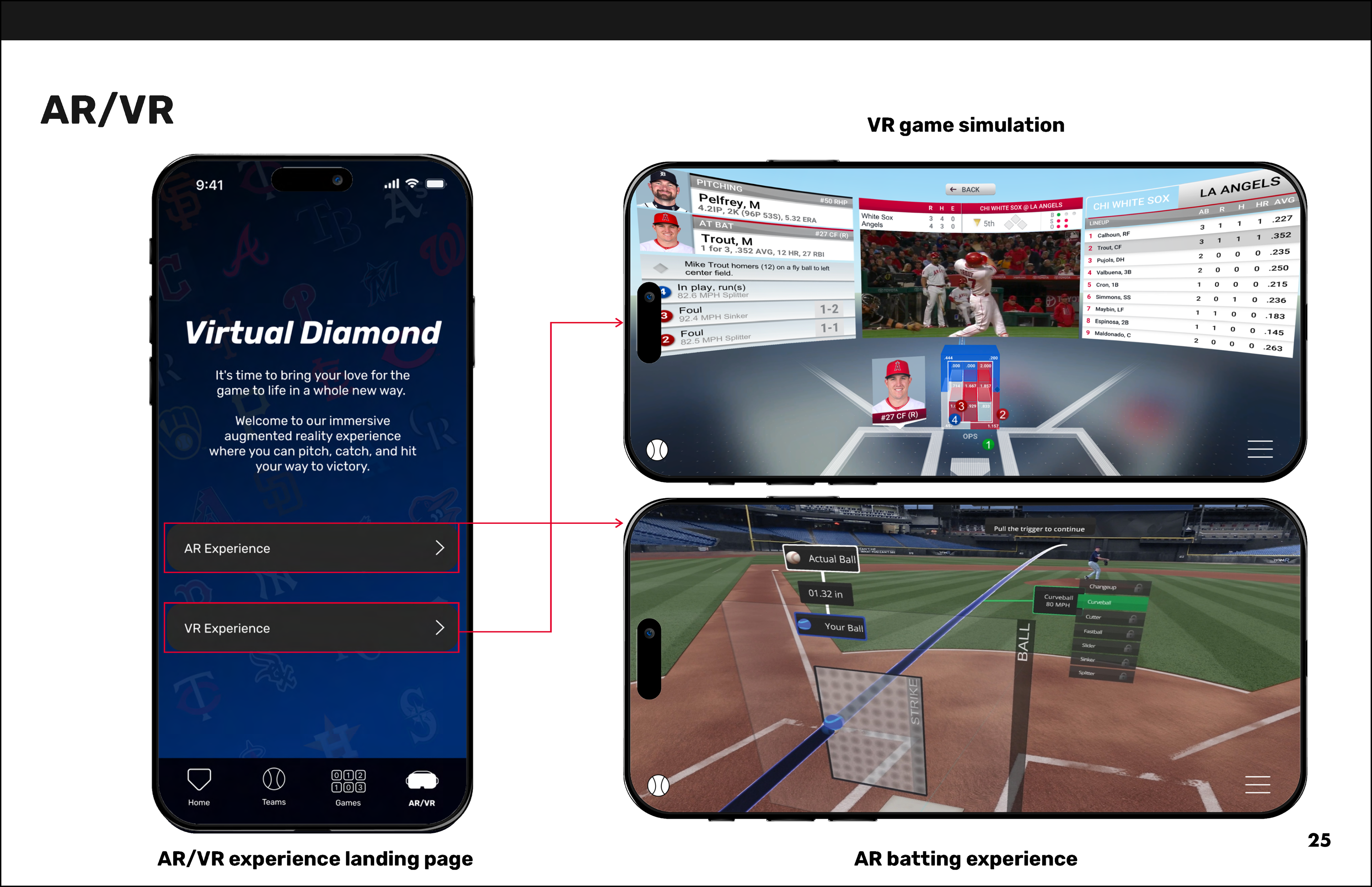
Because I wanted to create a more statistics-heavy app while still providing live game information and important news headlines, I analyzed both the current MLB app and its top competitor's apps, ESPN, FanGraphs, and theScore, to observe the different ways they presented their information. FanGraphs and theScore are much more statistics-based apps, while ESPN is focused on overall sports news. This mix of content focuses gave me a much better idea of design choices I liked, didn't like, and made me realize that the user experience, especially in the MLB app, needed better optimization.
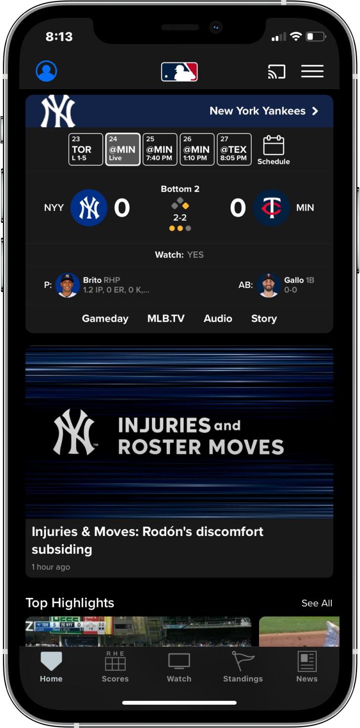
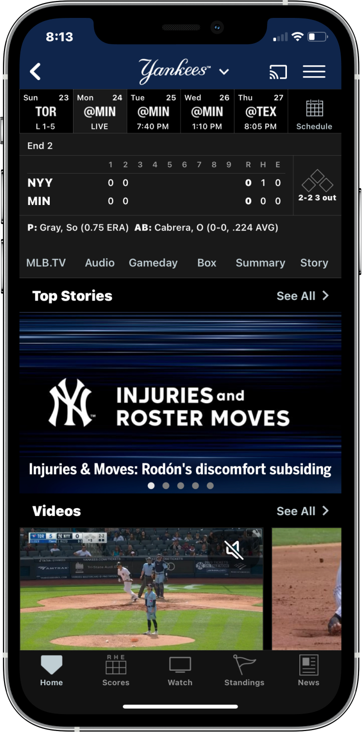
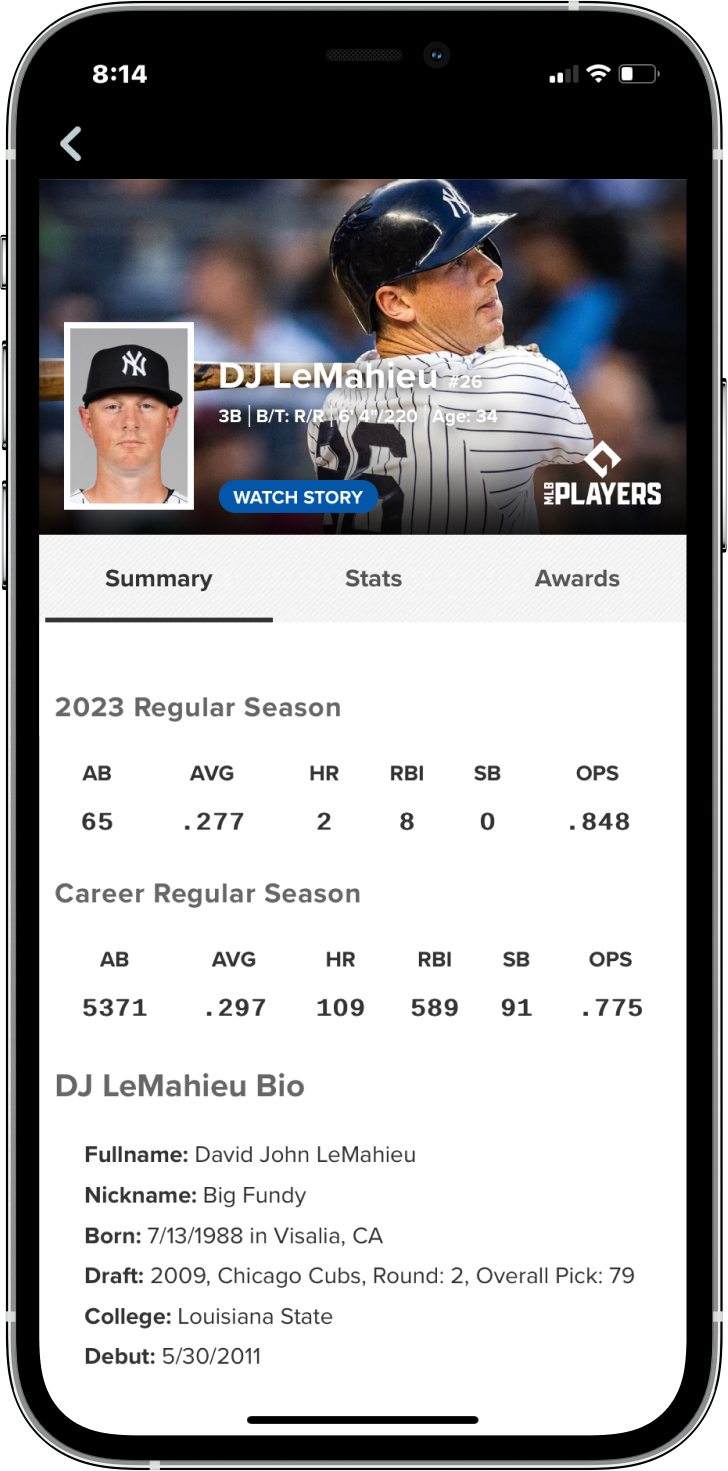
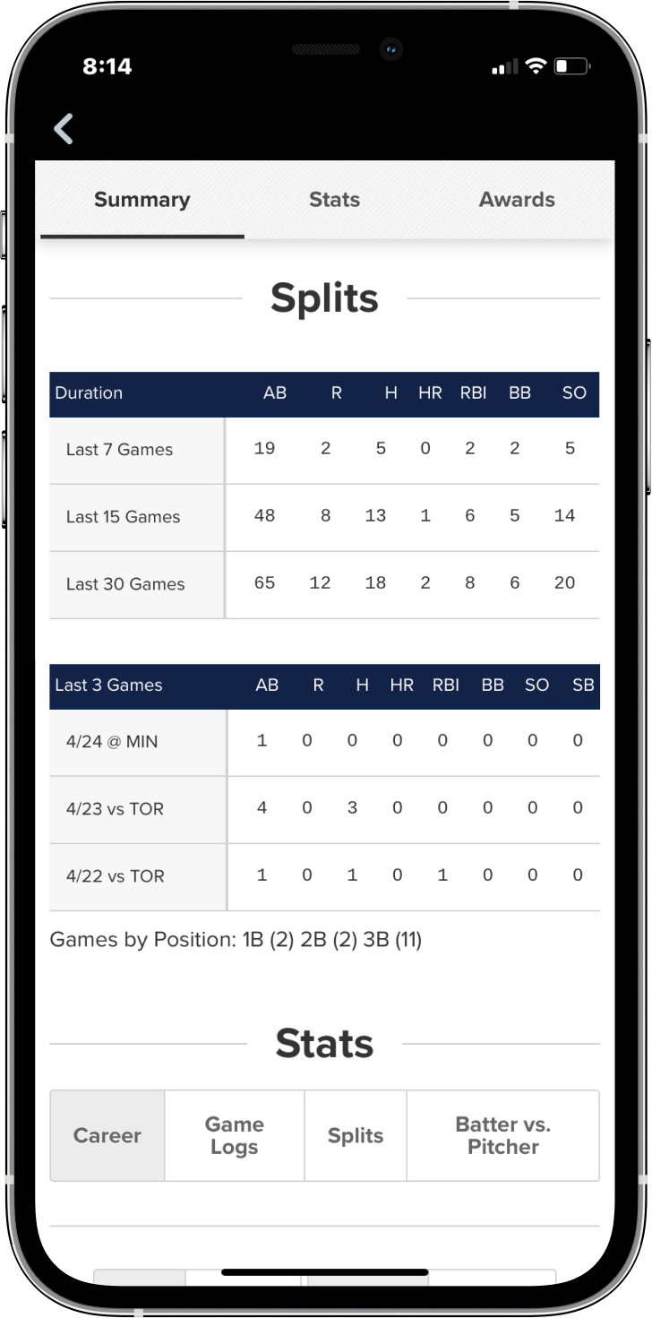
The Current MLB App
My observations/changes
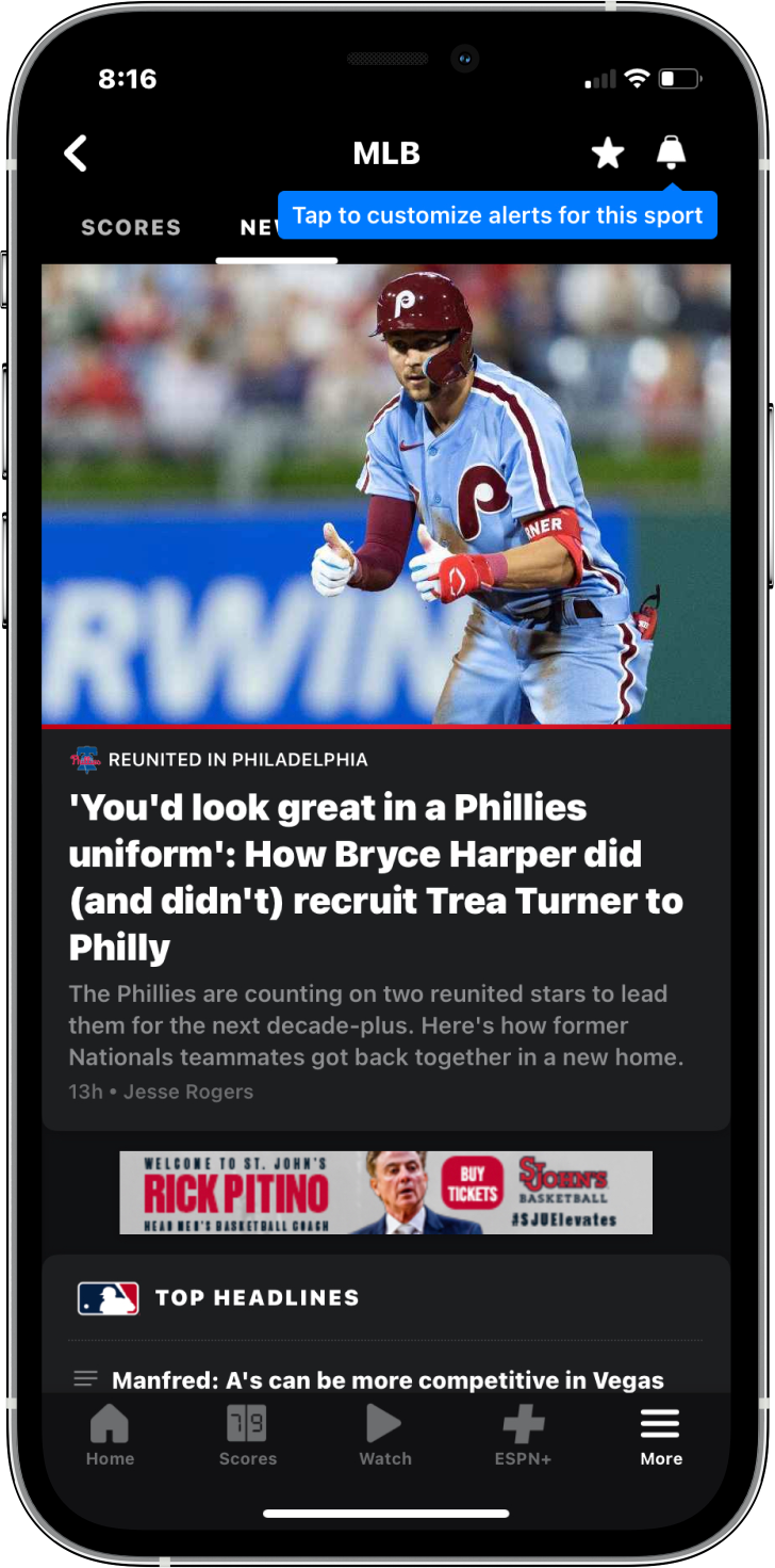
”Standings” shouldn’t be it’s own page, right now it is just a page with no other interaction other than scrolling.
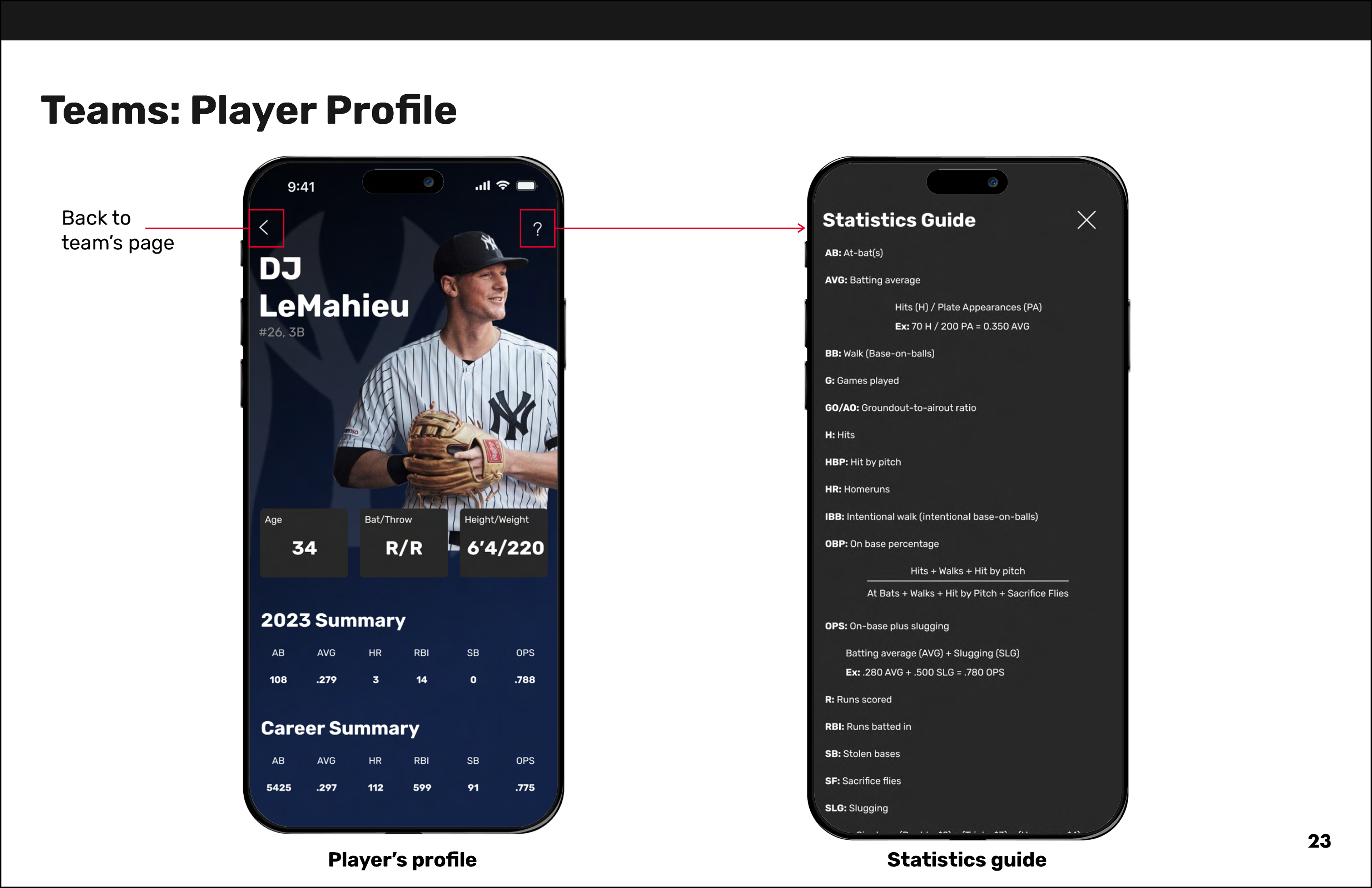
It would be helpful to have a feature that explains what each stat is and how it’s calculated.
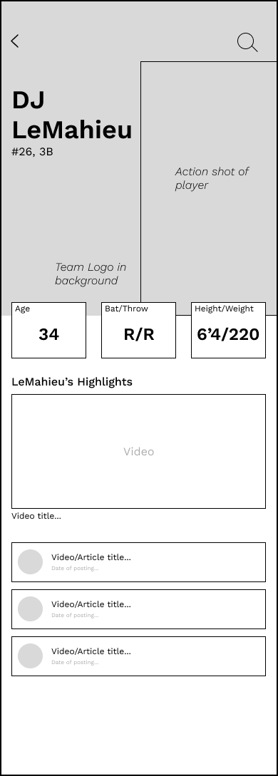
There's no way to find your favorite player’s highlights other than small section on homepage. It could be added to that player's profile.
There is no search feature anywhere, which would be very helpful when trying to find a team/player/stat/etc. very quickly.
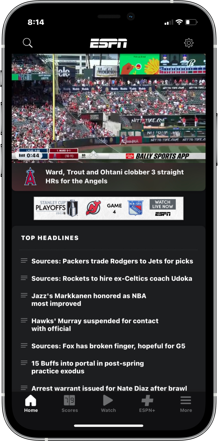
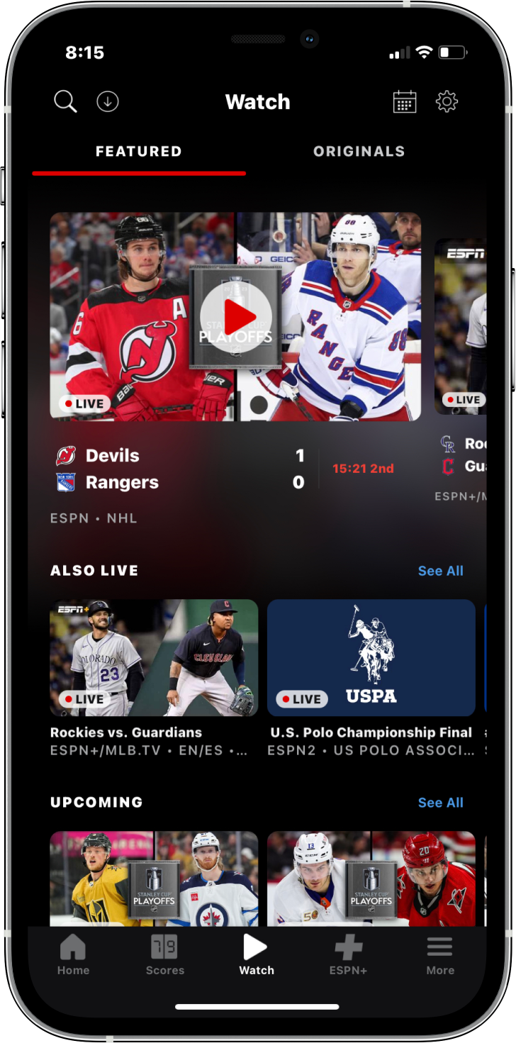
ESPN App
My observations/changes
The homepage (leftmost screen) is overwhelming and has a bit of a strange layout. When opened, it immediately plays the top video. The ”Top headlines” sections fills the rest of page and has no visuals, creating a block of text that will most likely get skimmed over.
The overall layout feels packed and small. The ads being placed throughout the app does not help with the clutter and overwhelming feeling.
Design Development
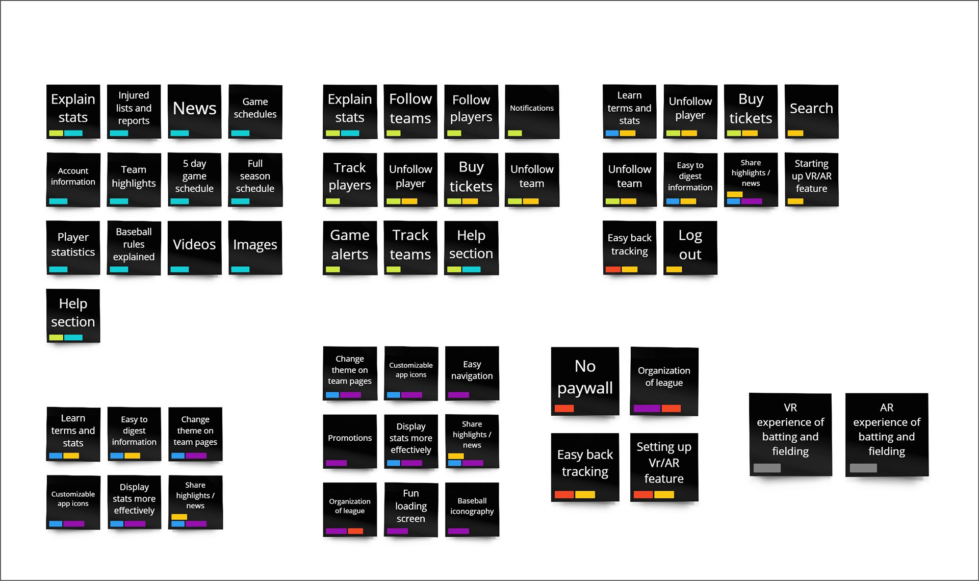
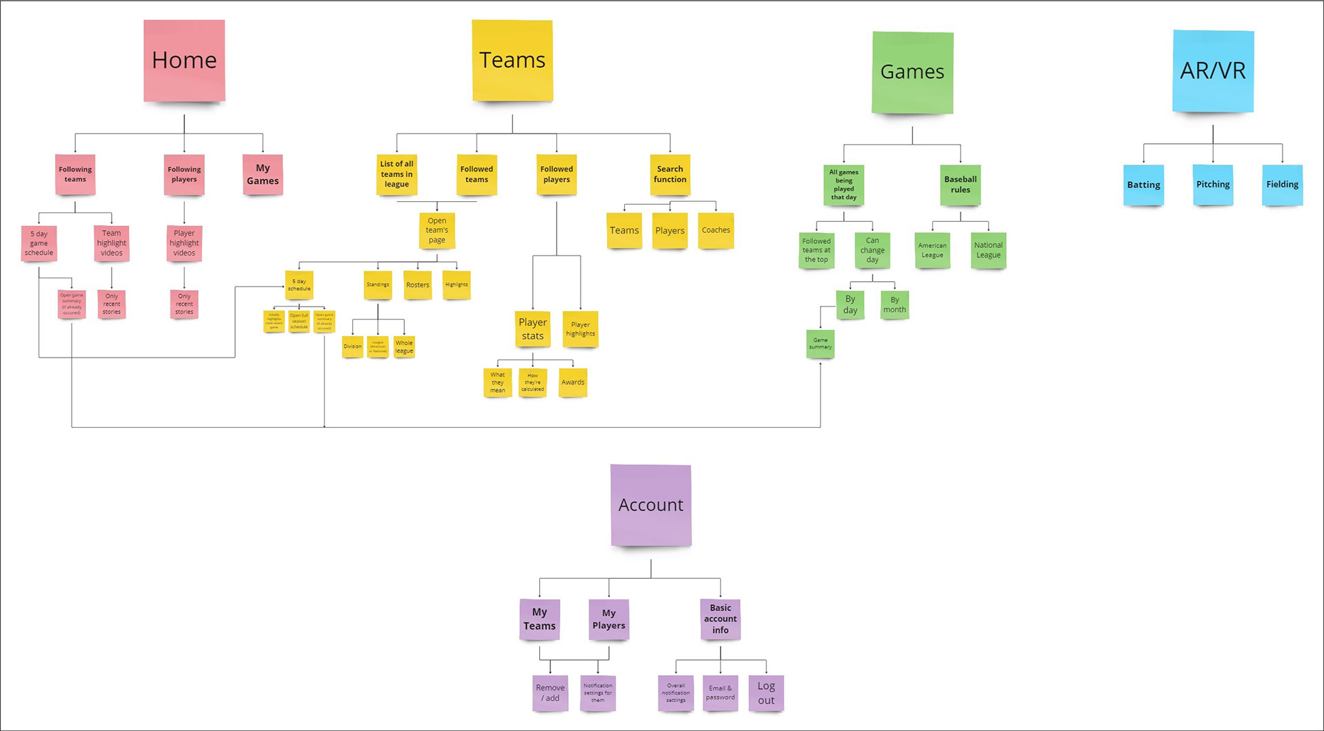
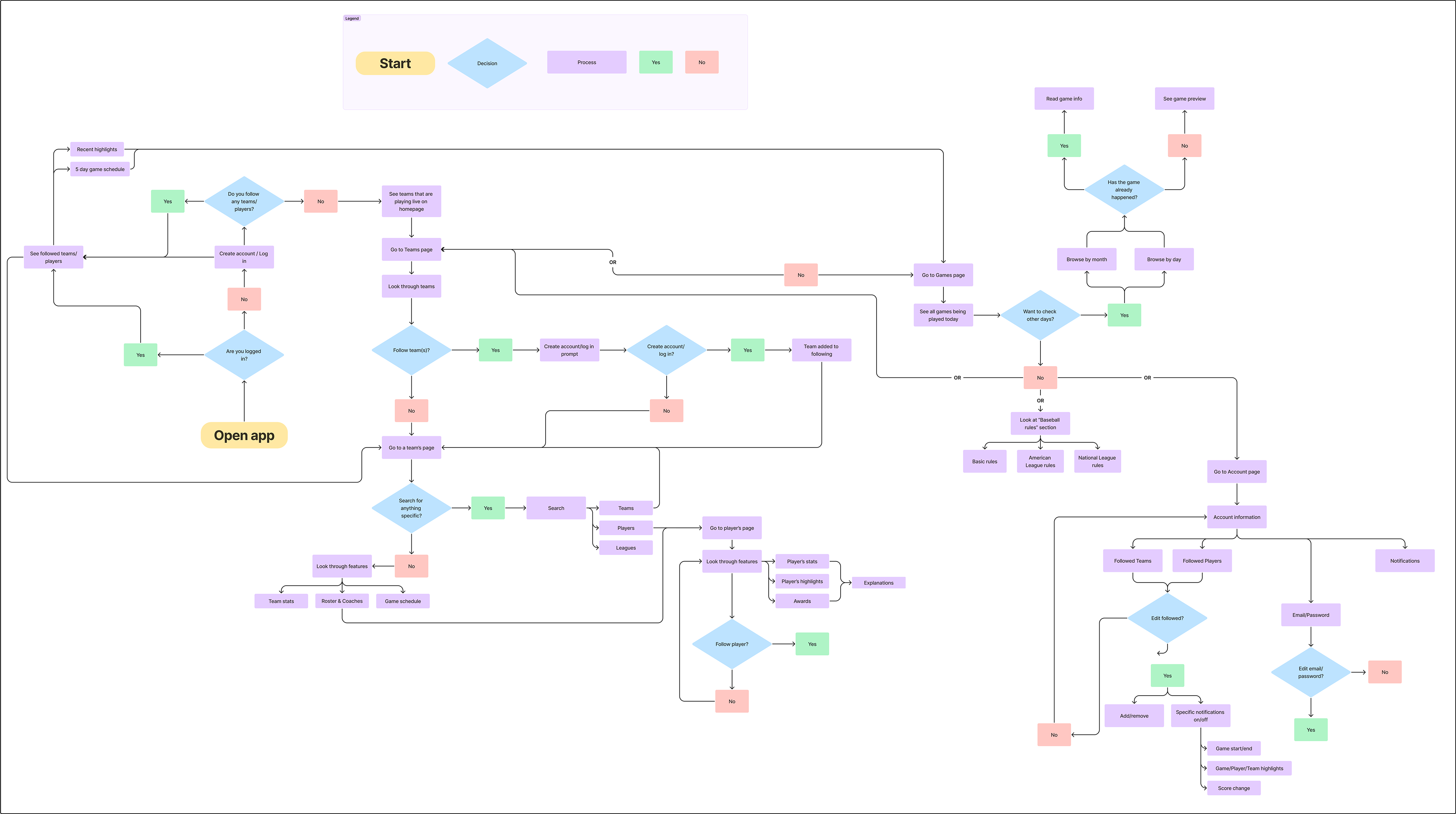
After gathering my notes about these existing apps, it was time to start thinking about how I wanted to structure my own. These diagrams show my process of building the foundations of my app including all of the features, the user experience, and the target audience. In order, there's the affinity diagram, card sort, and the process flowchart.
Initial Sketches/Notes
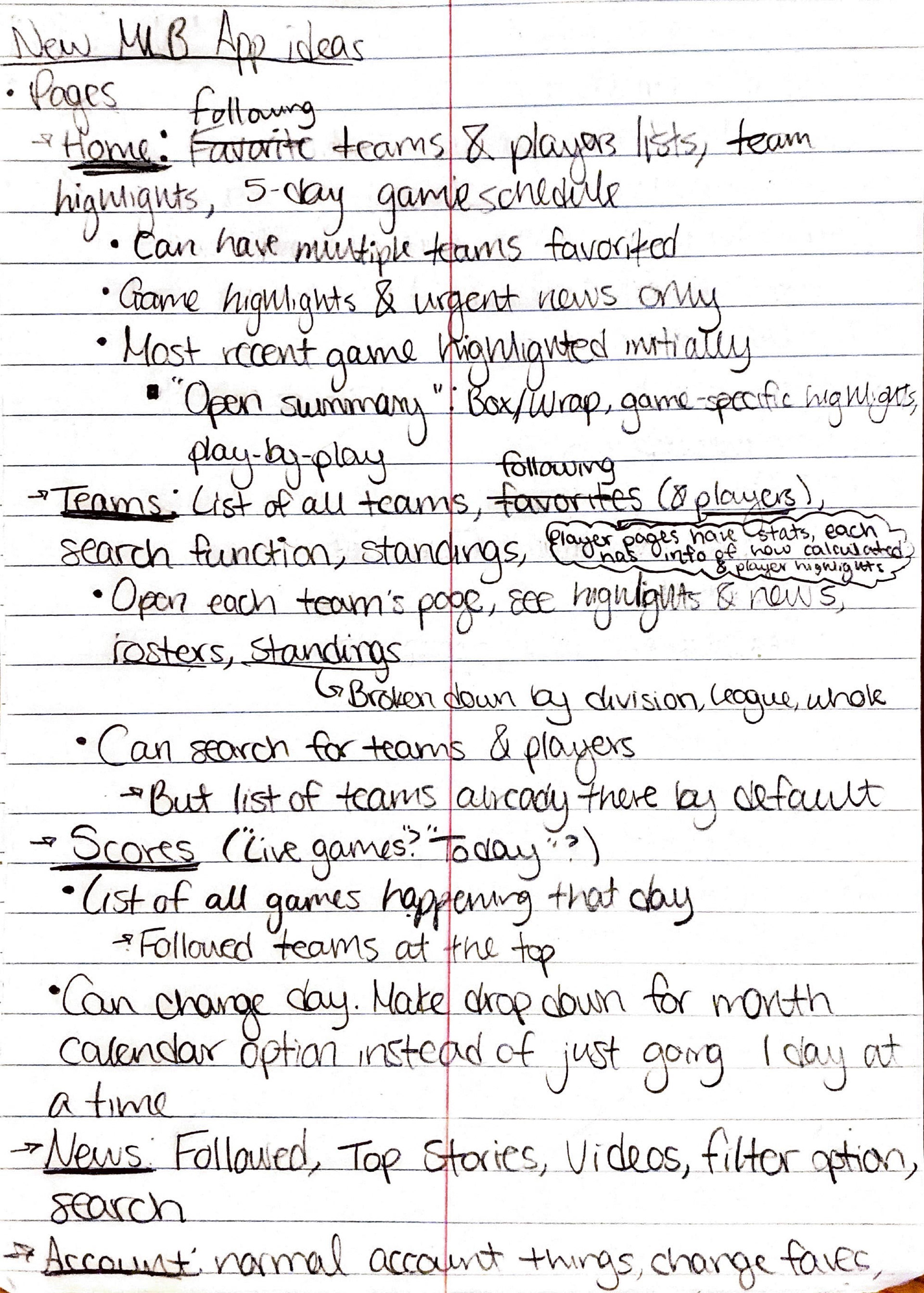
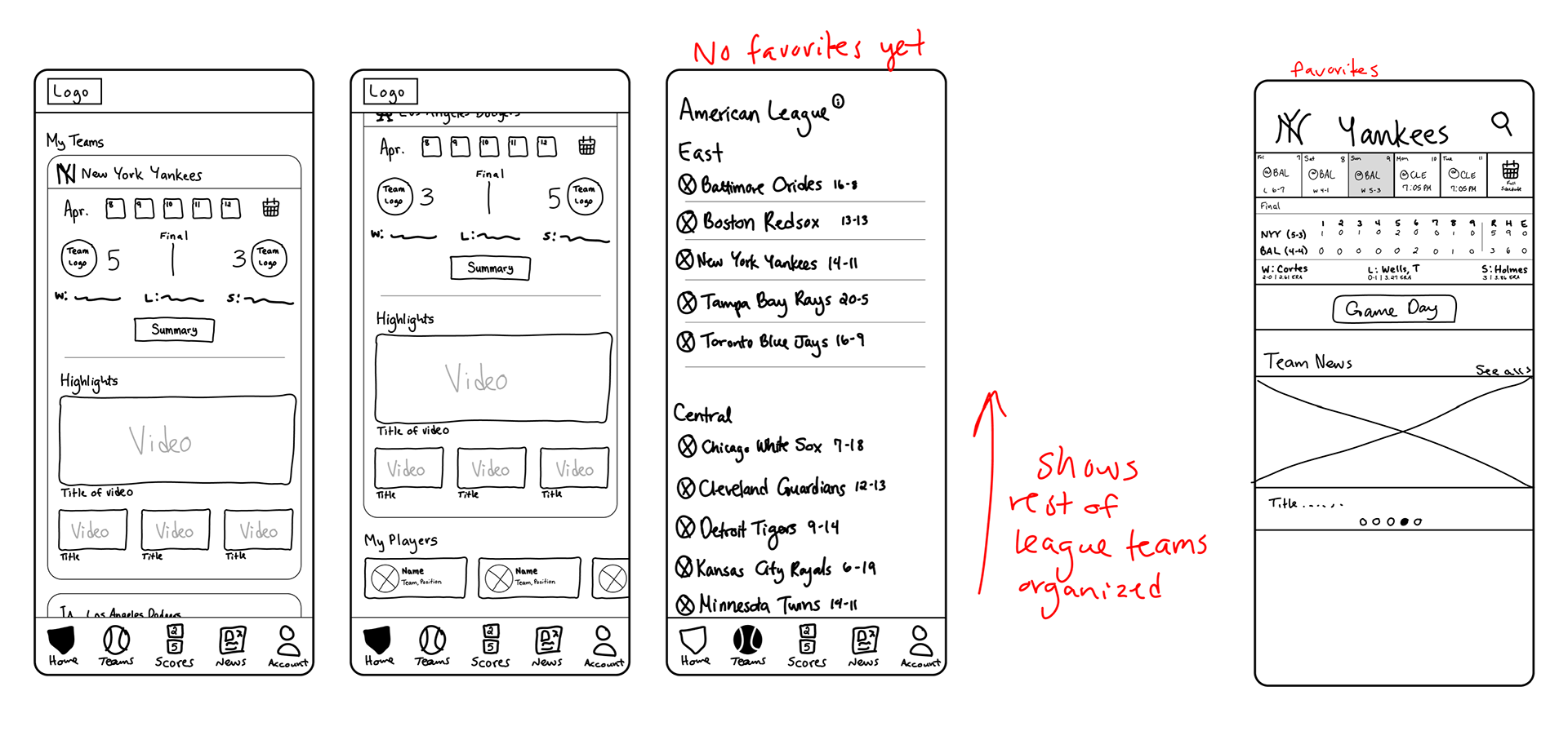
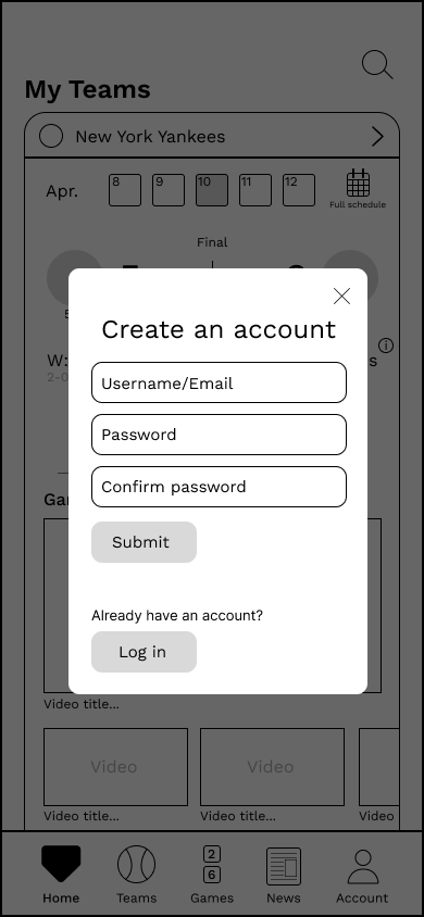
I started by writing out in my notebook the order of how I wanted the elements of each page to show. This helped make sure the organization made sense, as well as take what I visualized in my head and organize it without fully trying to design it yet. Once I felt comfortable with it, I started sketching out some of the initial pages. After a few, though, I decided to start wireframing.


Wireframing
As I was wireframing, I decided that I no longer wanted a news page, instead having important news stories for each team be found on their own page or on the home page when you "favorite" a team. While news like injuries, trades, and game highlights are important, they were not the main focus of the app.
App Design
Designing the UI
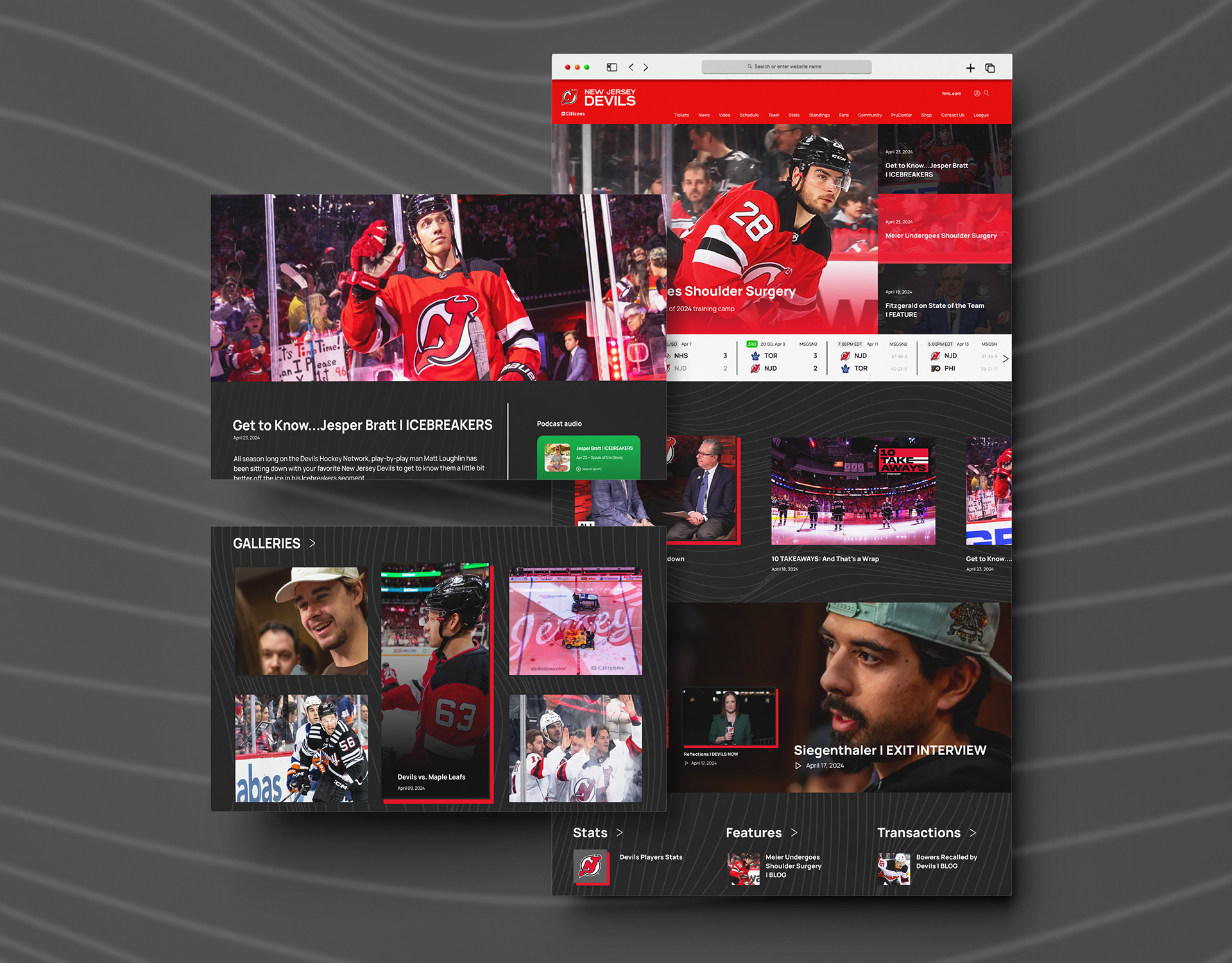
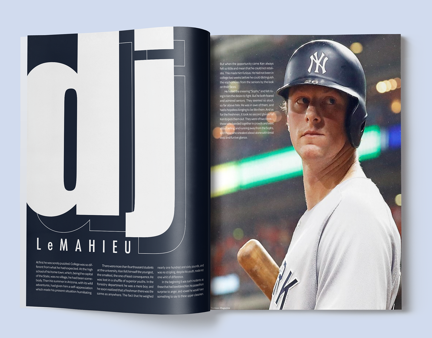
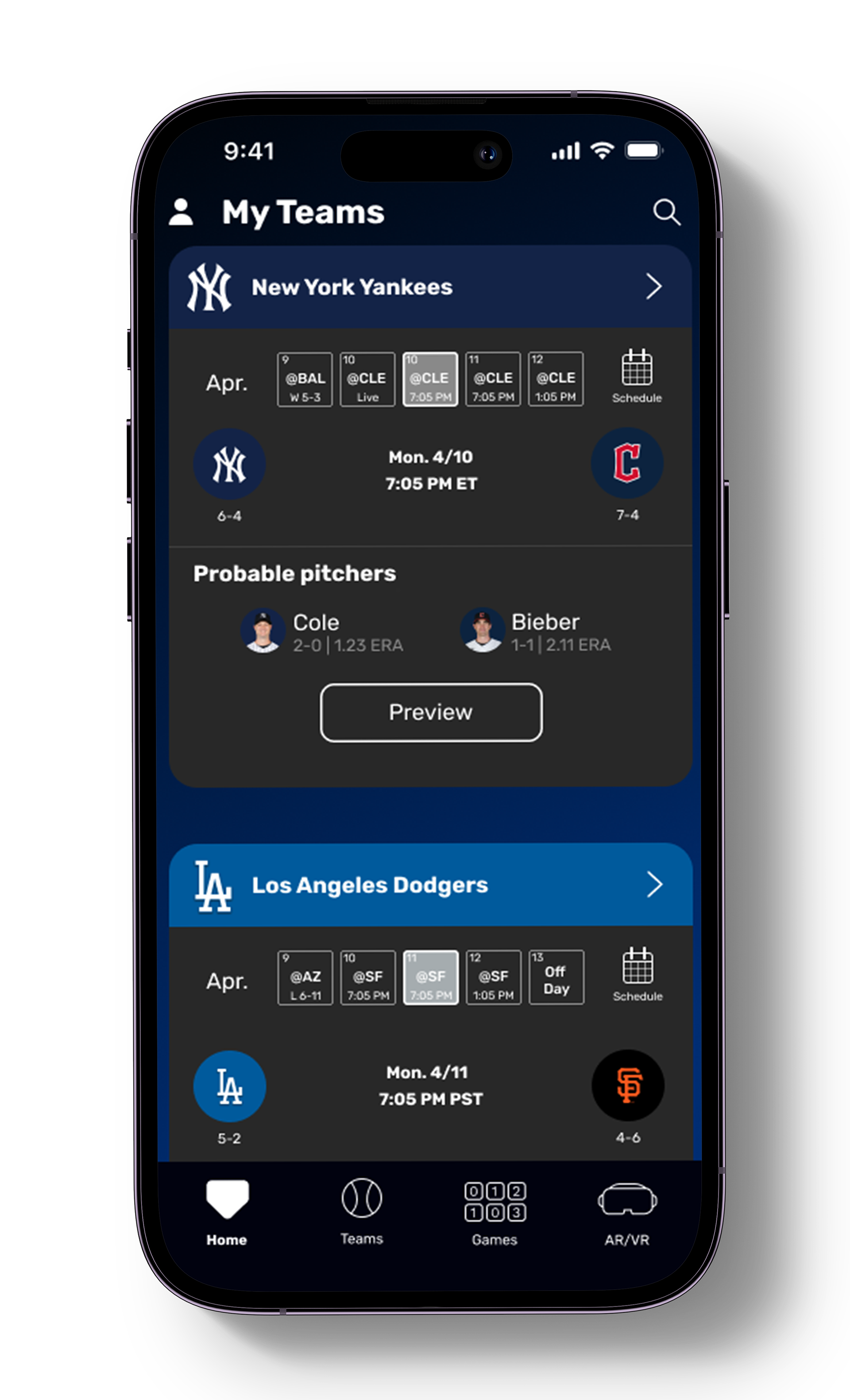
One thing I noted about the MLB app was that when you go to each team's page, there were subtle color changes to match with the team. While I thought this was a great idea, I felt it could be pushed further. In the past I've heard many fans complain that things are becoming too "clean" and "minimalist" and lacking personality, and that's what I felt was happening with the MLB app. It couldn't be too overwhelming and take away from the information, but it needed to feel more fun and connected to the teams.
